Excel data analysis templates toolkit
[Ad Space — Insert ad script here]
Downloads
Download the Markdown guide for offline reading or AI assistant context. The ZIP bundles all the Excel templates. Open the templates in Microsoft Excel or any compatible spreadsheet application.
Strategic analysis
3. Strategic analysis overview
Strategic analysis includes all those models and techniques that study the environment in which an organization operates. This environment ranges from external trends (economy, policies, technological innovations, etc.) to the organization (mission, strategy, goals, value chain, etc.) and its business environment (competitors, substitute products, customers, suppliers, etc.).
The objective of a strategic analysis is to investigate ideas and problems either to evaluate the strategic direction of the organization or to identify possible future strategies. I will focus only on the descriptive, predictive, and prescriptive analytical models of strategic analysis, excluding any strategy implementation and follow-up techniques.
4. ENVIRONMENTAL ANALYSIS (PEST)
OBJECTIVE
Identify external key trends and their impacts on an organization, company, or department.
DESCRIPTION
PEST analysis and all its variations (PESTEL, PESTLIED, STEEPLE, etc.) are used to analyze the key trends that affect the surrounding environment of an organization but on which the organization has no influence. The key idea is to identify the trends that can most affect the company, organization, or department in several areas:
-
POLITICAL
-
ENVIRONMENTAL
-
ECONOMIC
-
SOCIO-CULTURAL
-
TECHNOLOGICAL
-
…
Examples of key trends are an increase in interest rates, a new law, and the increasing use of mobile devices. Many more examples can be found quite easily, but the main idea that I want to transmit is that the division by area is just a way to facilitate the identification of the key trends, as the decision on whether to include a trend in one area or another has little or no effect on the model. This model is commonly used with other tools that complement the analysis of the business environment (competitive analysis, Porter’s five forces analysis, etc.), and it is usually used for SWOT analysis (strengths, weaknesses, opportunities, threats), in which it represents the external factors, namely opportunities and threats.

To avoid using this model as a mere theoretical tool, once the key trends have been identified, it is necessary to define the impacts of each one using cause–effect reasoning and to try to quantify the positive or negative effect that each trend can have on the organization in terms of revenues or costs. Some trends could have an almost direct impact, but others require several hypotheses, estimations, and calculations. Often it is necessary to determine the impact on intermediary indicators before calculating the monetary impact. For example, the growing sensibility for recycling can influence the company’s packaging. In this case we can estimate the loss of reputation first, then the decrease in demand, and finally the impact on revenues. Another important element to be identified is the timing of the impact, since it will affect the actions that will be taken and when they will be implemented.
There are two main methods for gathering data for this model. The first one is to exploit experts’ knowledge of several sectors and areas to identify the key trends affecting the future of the organization. Several techniques can be applied, such as the Delphi method, brainstorming, and think tanks. The second method is more “DIY” and it concerns gathering published forecasts of experts, futurists, organizations, governments, and so on. A common error with both methods is that people tend to jump directly to possible solutions, but doing so worsens the performance of the model. In this phase the focus just needs to be on the trends and on quantifying the impact that they will have on the organization.
5. COMPETITIVE MAP
OBJECTIVE
Analyze the positioning of a company or a product in comparison with other companies or products by evaluating several attributes.
DESCRIPTION
A competitive map is a tool that compares a company or products with several competitors according to the most important attributes. We can also add to the map the relative importance of each attribute. From this map we can understand how a company is positioned in relation to several attributes and define the key issues for strategic decisions. For example, we can decide to focus on the communication and promotion about the quality of our product if we are well positioned and it is important for customers.
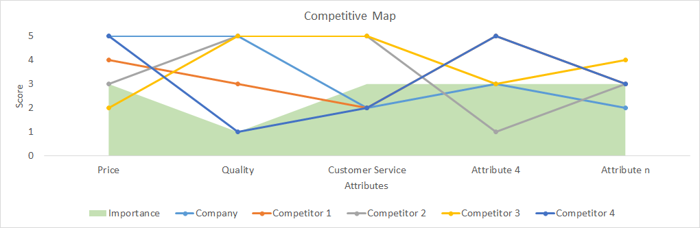
The data for this map are usually gathered through surveys. If the selection of attributes is not clear or the number of attributes is large, we can ask a preselection question whereby interviewees rank the most important attributes. Then they will be asked about the importance and performance of the selected attributes for each company or product. I suggest dividing the question into two parts:
-
Importance: give a score from 1 to 5 for each attribute;
-
Performance: give a score from 1 to 5 for each combination of attribute and company (or product).
6. BLUE OCEAN MODEL
OBJECTIVE
Identify possible disruptive business ideas.
DESCRIPTION
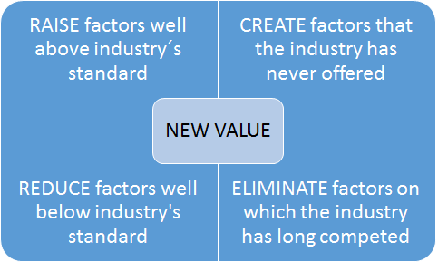
This method is described in the book Blue Ocean Strategy written by W. Chan Kim and Renée Mauborgne in 2005.[^8] The idea behind it is that companies should not focus on beating competitors (red oceans) but on creating “blue oceans,” meaning new uncontested markets. Accordingly, the competition will be irrelevant and new value will be created for both the company and its customers.
The book offers several tools and approaches to apply a blue ocean strategy systematically (these tools are available on the official website[^9]). One of the proposed tools is an action framework that suggests implementing a blue ocean strategy by modifying, creating, or eliminating factors concerning the product or service offered, for example a significant reduction of prices thanks to a different production methodology or the creation of touchscreens in the mobile industry.
7. IMPORTANCE–PERFORMANCE MATRIX
Decide whether to improve, maintain, or reduce specific company success factors or product attributes.
DESCRIPTION
This model is used to assess the performance of a company on several success factors or the performance of a product on several attributes. It can be a part of the competitive map model presented in this book.
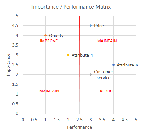
The data for this map are usually gathered through surveys. If the selection of attributes is not clear or the number of attributes is large, we can ask a preselection question whereby interviewees rank the most important attributes. Then the interviewees will be asked to give a score from 1 to 5 for each attribute.
7 IMPORTANCE-PERFORMANCE MATRIX
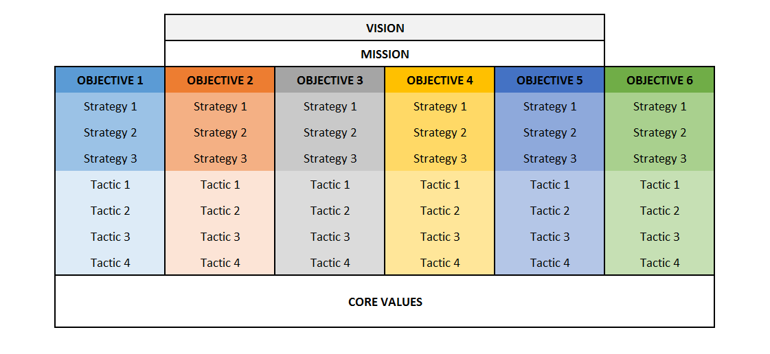
8. VMOST
OBJECTIVE
To describe what the company wants to achieve and how it intends to achieve it.
DESCRIPTION
It is a descriptive analysis tool that enables the reflection or communication of the strategic intent of a company, since it includes:
-
What the company wants to achieve: vision, mission, and objectives
-
How to achieve them: strategies and tactics
In more detail, the components of these tools are:
-
Vision: aspiration for future market-oriented results;
-
Mission: the fundamental purpose of the company: why the company exists;
-
Objectives: the goals that the company intends to reach; all these objectives are aligned with both the mission and the vision;
-
Strategies: long- and medium-term actions to achieve the objectives;
-
Tactics: short-term actions to achieve the objectives.
Usually the vision and mission are not clearly understood, but put simply the vision is “what we want to become,” for example “to be in the top three tech companies in the world,” while the vision is “what we want to do,” that is, why we exist, for example “to create innovative products ….” The vision and mission are often accompanied by a description of the company’s core values, meaning the company’s principals that reflect its culture (e.g. integrity, transparency, and environmental friendliness).
From this analysis we can obtain some of the strengths and weaknesses to include in the SWOT analysis. If the VMOST is well defined and communicated and people are committed to achieving what it states, it is a strength in the SWOT; otherwise, it is a weakness.
The information for the VMOST can already be defined and documented in a company or it can be built through brainstorming, workshops, or interviews with high-level managers and directors.
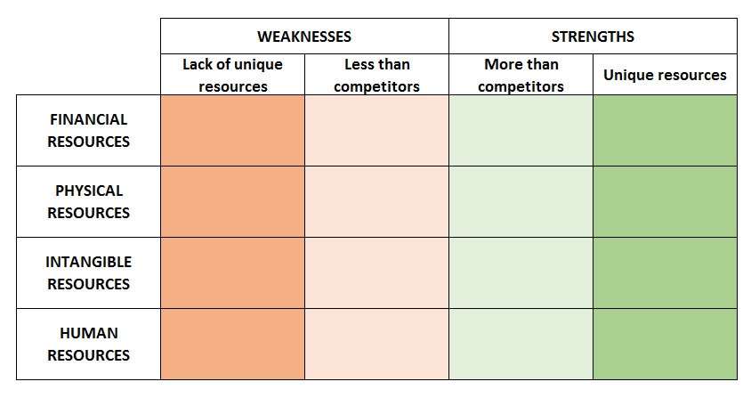
9. RESOURCE AUDIT
OBJECTIVE
Identify the weaknesses and strengths within an organization.
DESCRIPTION
This model identifies the resources available to an organization, which can be divided into:
-
Financial resources (funds, loans, credit …)
-
Physical resources (plants, buildings, machinery …)
-
Intangible resources (reputation, know-how …)
-
Human resources
To define the strengths and weaknesses (which can be used afterwards in a SWOT analysis), we should ask several questions, such as:
-
Are the available resources enough for the current competitive situation?
-
Will they be able to support future developments?
-
How difficult is it to obtain more of these resources for the company? And for its competitors?
-
How difficult is it for a competitor to imitate these resources or core competencies?
-
How important are they for the core business?
Simplifying, we can state that it is a strength for the organization when it possesses unique resources or when it has more or easier access to imitable resources than its competitors.
The identification of strengths and weaknesses is based on qualitative reasoning, but this can be supported by both quantitative data (financial ratios, reputation indexes, employee turnover rate, etc.) and qualitative data (workshops, interviews, brainstorming, etc.).
10. BOSTON MATRIX
OBJECTIVE
Decide the best allocation of resources among different products, product lines, or business units.
DESCRIPTION
Created by the Boston Consulting Group, this method aims to decide how to allocate resources depending on the market positioning of different products or services. The market positioning depends on two variables:
-
Market share: more than the simple percentage of the market share, the relative importance depends on the number of competitors, the position according to the market share, and how the company compares to its largest competitor. There is also a big assumption that limits this model: the market share is positively related to earnings and profitability.
-
Market growth: this is the growth rate of a product or service, and it represents not only the prospective growth of earnings but also the attractiveness of a market.
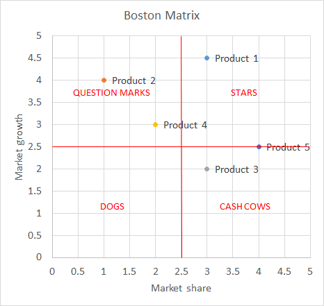
This matrix aids in decision making and is based on the following four categories:
-
Stars: these products maintain the level of investment and strategy and will be cash cows when the market growth declines;
-
Cash cows: these are products with a high market share and low growth; the investment needed is limited;
-
Question marks: it is important to improve the strategy by investing in the right levers to increase the market positioning and sales. The goal is to move these products to the “stars” box;
-
Dogs: here there are two options, either not to invest in these products or to redefine them.
The Boston matrix is considered a useful tool to define strengths and weaknesses in SWOT analysis, but it can also reveal future opportunities for the organization.
The data can usually be gathered from published information concerning industries, sectors, products, or services. If the data are not available, it is possible to estimate the market share by surveying a representative sample of customers.
11. PORTER’S FIVE FORCES
OBJECTIVE
Analyze the competitive environment in which the company operates.
DESCRIPTION
This tool is part of the external strategic analysis, and it is useful for completing the SWOT analysis concerning opportunities and threats. While the PESTEL analysis concerns the external environment and macro trends, Porter’s technique focuses on the industry domain.
It is very important before undertaking this analysis to establish the company domain of competition, since this can change the results significantly. The analysis of the competitive environment is undertaken through five categories:
-
Competitors: how strong is the rivalry among competitors?
-
New entrants: how easy is it for new entrants to start competing?
-
Substitutes: how many and how significant are they?
-
Buyers: how many are there and how easily can they change supplier?
-
Suppliers: how many are there and how high are the switching costs for buyers?
The answers to these questions reveal several opportunities or threats for the company; for example, if customers (buyers) have few options and their switching costs are high, this is an opportunity for the company.
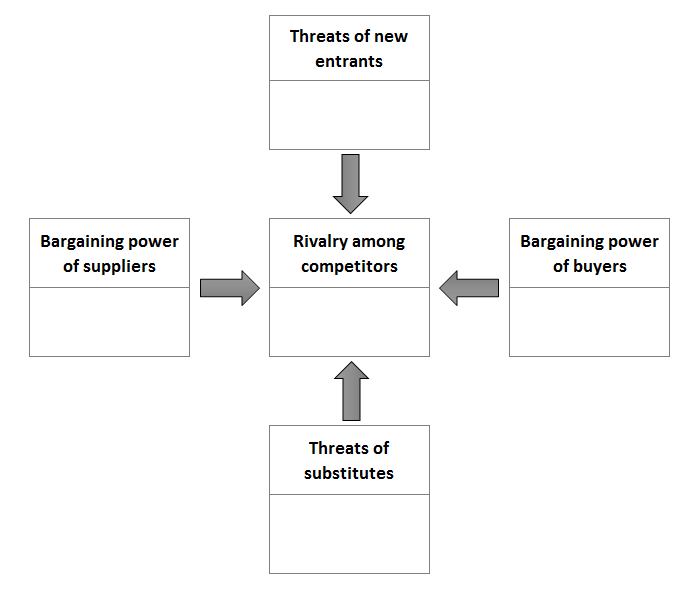
The data can be gathered from extensive market research and from industry experts through interviews, workshops, and brainstorming.
12. PRODUCT LIFE CYCLE ANALYSIS
OBJECTIVE
Define the maturity of the industry in which a company is competing or the maturity of a product that it is selling.
DESCRIPTION
Several studies have been carried out on industries’ life cycles. Industries and products usually start from an emergent phase, pass through a growth phase, and finally reach a mature phase. At this point either they start the cycle again thanks to innovations or they decline.
This is a tool made for reasoning about the maturity of the industry and the maturity of the kind of products being manufactured. To define the phase in which the company is positioned, consider the following:
-
Emergent phase: this is characterized by a small number of firms, low revenues, and usually zero or negative margins;
-
Growth phase: the margins are increasing rapidly (for a while, but less in the last part of the growth phase), as well as the number of firms;
-
Mature phase: the global revenues are increasing at a far slower rate; both the margins and the number of firms are decreasing.
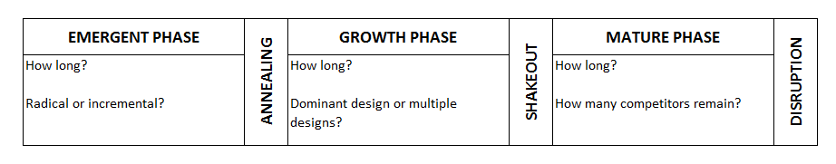
Usually, after the emergent phase, the dominant standards are defined and the rise of one or a few companies is experienced (annealing). Due to rapidly increasing margins, many companies imitate those successful pioneers, and, consequently, the margins start to decrease and a few companies start to leave the market (shakeout). Only the most efficient firms remain in the market during the mature phase, at the end of which we have either decline or disruption thanks to innovation or a demand shift. Finally, the process starts again.
13. DIVERSIFICATION MATRIX (G.E. MATRIX)
OBJECTIVE
Make decisions on diversification strategies.
DESCRIPTION
A firm’s scope can be to broaden by diversifying its products or services, which can be either related or unrelated to the core business. To decide whether to maintain, create, or close specific business units, we must start with a detailed analysis of advantages and disadvantages. A simple matrix is used to explore the main opportunities concerning diversification, which depends on one side on the industry attractiveness of business units (which can be measured by Porter’s five forces analysis) and on the other side on the competitive advantage of the business units.
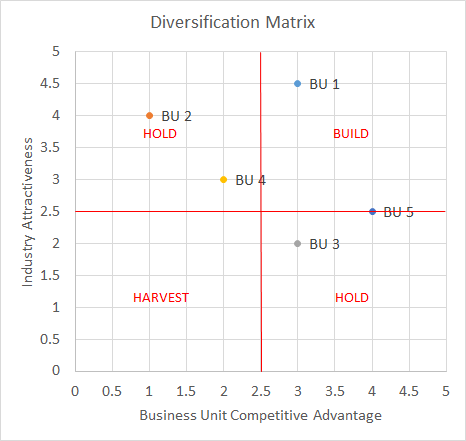
For business units in the upper-right box, the decision should be to invest more, while for the boxes in which there is either good industry attractiveness or a good competitive advantage, it should be to maintain the current course. Companies should consider closing business units that fall into the lower-left box.
The data are mainly qualitative and usually derived from other analytical tools, for example Porter’s five forces or the industry competitive life cycle for the Y axis (industry attractiveness) and competitive maps or resource audits for the X axis (business unit competitive advantage).
14. INTERNATIONALIZATION MATRIX
OBJECTIVE
Make decisions on internationalization strategies.
DESCRIPTION
An internationalization strategy implies several preliminary analyses to respond to the two main questions: where and how? However, the main trade-off when internationalizing is between the advantages of global integration and the disadvantages of local responsiveness (the need for adaptation).
The matrix with these two indicators can be filled either with different industries (in the case that we want to decide which business unit to internationalize) or with different competitors to identify business opportunities.
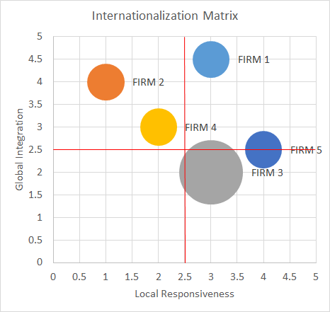
With this matrix (in the example of analyzing competitors), it is possible to find opportunities in which competitors are not exploiting the upper-left corner, implement strategies with lower adaptation costs, and obtain better global integration advantages. In addition, opportunities can be found for which the conditions are not optimal for other firms (lower-right corner) and hence there are no competitors there, so it is possible to be profitable. The data for this model are gathered through published articles or studies, industry public data, and experts’ opinions (brainstorming, workshops, etc.).
14 INTERNATIONALIZATION MATRIX
15. BUSINESS MODEL CANVAS
OBJECTIVE
Analyze our own business model or competitors’ business models.[^10]
DESCRIPTION
This tool, invented by Alexander Osterwalder et al.,[^11] can be used to analyze how an organization is creating and delivering value to its customers. Even though its original purpose was to help in creating a new product or business, in this book the business model canvas is presented as an analytical tool, since those kinds of models are not covered. This model can also be useful for understanding whether a company is a competitor or not, since it analyzes the value proposition, which responds to customers’ needs. In fact, companies compete not on products but on the needs that they satisfy or the problems that they solve for their customers.
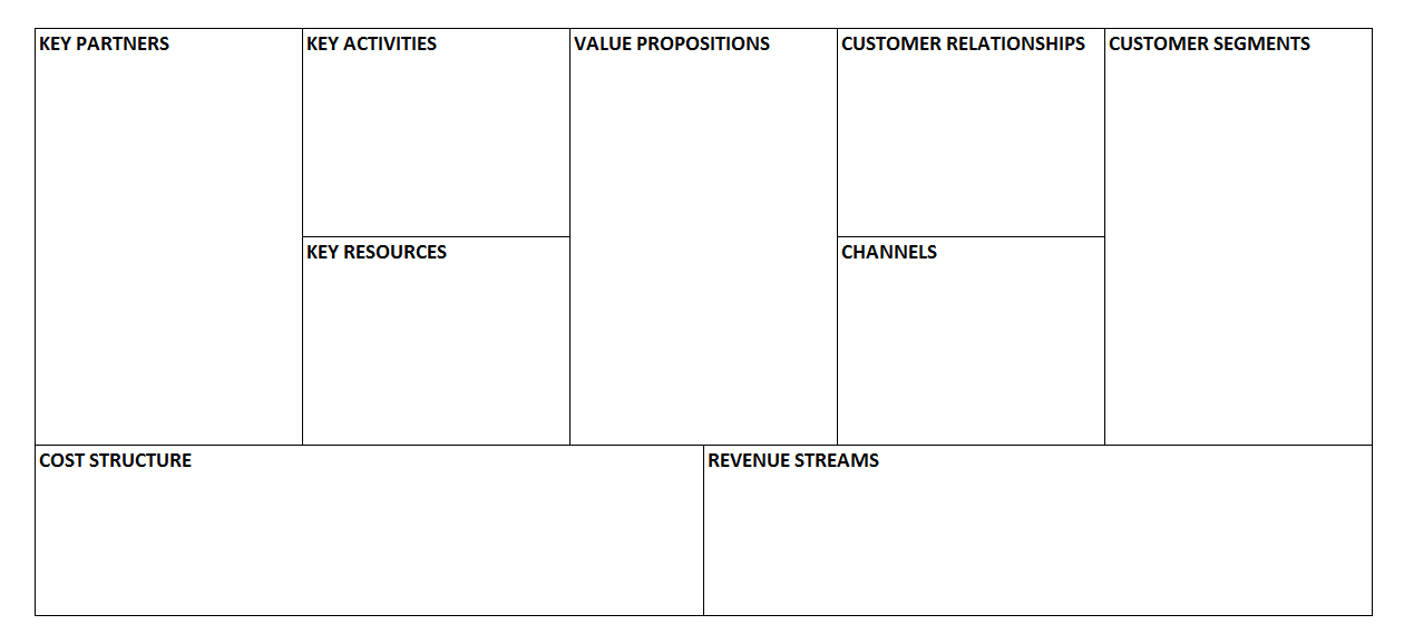
The study includes the analysis of nine building blocks of the business and how they are related to each other. First we define our customer segments and then the value propositions that we are offering to them. The value proposition is a need that we satisfy or a problem that we solve for a specific customer segment. It is possible that we are offering different value propositions to different customers; for example, a search engine is providing search results to web users and advertising spaces to companies. Then we identify how to deliver this value to our customers (channels) and how we manage our relationships with them (customer relationships). At this point we are able to describe our revenue model (revenue streams). However, to understand how to create our value propositions, we need to identify our key activities, key resources, and key partners. These three blocks allow us to identify our cost structure. For more information about this model, visit the official website[^12] or sign up for the free online course “How to Build a Startup.”[^13]
16. SWOT ANALYSIS
OBJECTIVE
Concerning a company, identify the main strengths to maintain, opportunities to exploit, threats to reduce, and weaknesses to manage.
DESCRIPTION
The SWOT analysis is the consolidation of internal and external analyses, and it is used for strategy definition, usually in its first stage, to establish the bases of several strategic actions:
-
External analysis: analysis of the external opportunities and threats resulting from the external environment (PEST, PESTEL); for example, the increasing use of mobile devices can be an opportunity to exploit or the increasing cost of energy can be a potential threat.
-
Internal analysis: internal strengths and weaknesses resulting from the internal analysis (MOST, resource audit, etc.) and from competitive analysis (competitive map, importance–performance matrix). For example, a well-known brand is a strength and a poor company strategy definition is a weakness.
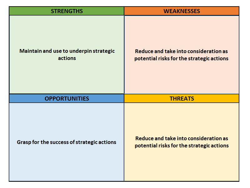
From this matrix the analyst can define strategic actions that exploit existing opportunities, using the company’s strengths as critical success factors and reducing the risks that can be provoked by potential threats and the company’s weaknesses. Since this is a consolidation of several other analyses, the sources of data depend on previous analyses and on several gathering techniques, such as brainstorming, the Delphi method, and surveys. The consolidation process can be performed directly by the analyst, but it is usually a good practice to consolidate the results or submit the analysis to other company members, for example through workshops or think tanks.
17. ANSOFF’S MATRIX
OBJECTIVE
Define the most appropriate business strategy based on the existence of markets and products.
DESCRIPTION
Ansoff’s matrix is usually performed after a SWOT analysis, in which strengths, weaknesses, opportunities, and threats can be transformed into business strategies:
-
Market penetration: the organization decides to use existing products in the existing market by improving tactics and strategies to push sales, for example through advertising, promotion, and pricing;
-
Product development: the organization decides to develop new products for an existing market or to add new features;
-
Market development: the organization decides to sell existing products to new markets, for example exporting to new countries;
-
Diversification: the organization decides to take a more radical approach by creating a new product for a new market. This can be the result of an opportunity caused by a new trend, identified in the SWOT analysis.
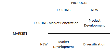
Once the strategy has been defined using Ansoff’s matrix, the objectives, strategies, and tactics can be revised in the VMOST model. The information needed for this matrix can usually be found in previous internal analysis, external analysis, and SWOT analysis.
Pricing and demand
18. Pricing and demand overview
Setting the right price is one of the most complicated decisions to take but also one of the most rewarding. To choose the price that maximizes revenues and benefits, it is necessary to determine the willingness to pay (WTP) of customers. Ideally, we should define the WTP of each customer, but in most cases it is only possible to establish the WTP for several customer segments.
We can define the WTP as the highest price that a person will accept to buy a product or service. However, it is useful to differentiate between two concepts: the maximum price and the reference price.[^14] The maximum price is the value of a reference product plus the differentiation value of the product of interest; for example, the WTP of brand B is the value of brand A plus the differentiation value between the two brands. The reference price is the highest price that a person would pay for a product or service assuming that she has no alternative. In conclusion, we can say that the WTP is either the maximum price or the reference price depending on which is the lowest. Several methods can be used for the estimation of the WTP, which can be divided into two main groups: observations and surveys.
Figure 15: Classification of Methods for WTP Estimation^14^
**
MARKET DATA
The advantage of market data is that they are easily accessible and imply no cost other than the time dedicated to the analysis. However, there are several drawbacks:
-
Usually there is not enough price variation in the data to test the necessary range of WTP;
-
We are only analyzing our customers and not the market as a whole;
-
We can just define whether an individual has a higher WTP than the selling price, and we lose information about customers who decided not to purchase the product;
-
Usually demand curves are estimated through regressions, and in this case several conditions have to be met (see 36. INTRODUCTION TO REGRESSIONS ).
EXPERIMENTS
There are two main kinds of experiments:
-
Laboratory experiments: purchase behavior is simulated in scenarios in which prices and products are changed (a main drawback is that the purchase intention can be biased, since the participants are aware of the experiment and because they are not spending their money or real money);
-
Field experiments: these are tests in which different prices and products are offered to customers for real purchase.
A general drawback of experiments is that they are quite costly.
DIRECT SURVEYS
Surveys are a faster and less expensive method for determining the WTP. Either experts or customers directly can be interviewed. In the first case, sales and marketing experts are asked to predict the WTP of customers. This method usually performs better in situations in which the number of customers is small, while it performs poorly when the customer base is large and heterogeneous. In this case it is preferable to conduct customer surveys to ask customers their WTP directly. A widely used technique is the one proposed by Van Westendorp. Although this method is easy and direct, it has several drawbacks:
-
Customers can have incentives to underestimate their WTP (to influence real product prices) or to overestimate their WTP (to show a better social status in front of researchers);
-
Even if customers try to reveal their true WTP, this is a difficult and complicated task and the response can be biased unconsciously by several factors;
-
If buyers have no market reference, they can overestimate their WTP.
**
INDIRECT SURVEYS
With indirect surveys a situation more similar to the purchase process is presented, since the respondents are asked to indicate whether they would purchase a specific product with a specific price or not. For this reason the performance tends to be better than that of direct surveys. There are two main techniques: conjoint analysis and discrete choice analysis.
Conjoint Analysis
Different products with varying attributes and price are presented to the respondents, who are asked to rank them. Since it is not possible to determine whether the respondents would buy the product at the presented price, usually they are also asked to identify a limit below which they will not buy the product. A disadvantage of this method is that the usual market prices are shown; therefore, if the respondents’ WTP is not included in these prices, the estimated WTP can be quite different from the true one.
Discrete Choice Analysis
As in conjoint analysis, products are decomposed into attributes for which the utility is calculated. However, in discrete choice analysis, the respondents have to choose a product from a set of several alternatives. The main methodological difference is that attributes’ utility is estimated at an aggregated level (the population), while in conjoint analysis it is calculated for each individual. To estimate the utility at the individual level, the results of discrete choice analysis can be processed using a hierarchical Bayes approach.
19. PRICE ELASTICITY OF DEMAND
OBJECTIVE
Determine the price sensitivity of demand.
DESCRIPTION
The price elasticity of demand is a measure that represents how much the demand will change due to a change in the price. With a price elasticity of “1,” a 5% increase in the price means that the demand will increase by 5%. However, the price elasticity of demand is usually negative, since an increase in the price is likely to produce a decrease in the demand. Elasticities of -1 or 1 are considered to be “unit elasticities,” since a variation in the price provokes a proportional variation in the demand (positive or negative). Elasticities with an absolute value less than 1 (for example 0.4 or -0.6) are considered to be inelastic, since a variation in the price results in a less than proportional variation in the demand, while elasticities larger than 1 are considered to be elastic.
To calculate the price elasticity, this formula can be applied:
PED = (%ΔQd) ÷ (%ΔP)
where the percentage change in the demand is divided by the percentage change in the price. We can either take the two nearest offered prices or calculate the elasticity by taking more distant prices. We can also calculate the elasticity using midpoints between offered prices. With a PED of -0.4, if we increase the price by 20%, we can expect the demand to decrease by 8% (-0.4 * 0.2 = -0.8). However, this calculation is less precise for large price variations. It is usually better to calculate “arch elasticities,” in which the change in the demand is calculated incrementally at each 1% price variation (in our case 20 times). With this calculation our reduction in the demand is estimated to be 7%: 1 - (1.2 ^ (-0.4)).
In addition, when calculating the PED, it is important to consider timing and inflation:
-
Timing: if our data are spread across a large period of time (i.e. several years), we must consider that the demand could be different due to a change in consumer preferences, new substitutes, and so on. The supply could also have changed, and this has an important effect on the price equilibrium with demand.
-
Inflation: we should use real prices, since for example if our price has increased by 3% but inflation is about 3%, then in practice our price has not changed.
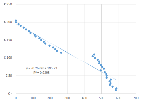
The data can be analyzed in more detail using a regression (see 38. LINEAR REGRESSION ). For example, in Figure 16 the price elasticity changes drastically at a certain price level. In other cases the data can be too scattered. In either case we should consider segmenting the data, since this can be caused by the heterogeneity of the respondents (e.g. seniors are less price sensitive while young people are far more price sensitive).
The data used for a PED calculation can be either real data from transactions or survey data. If we use transaction data, we must be able to exclude demand variations due to different factors from the price (we can for example include other predictor variables in the regression – see “Multivariate Regression” in chapter 39. OTHER REGRESSIONS ). If we use survey data, the pricing models described in the following chapters can be considered.
20. GABOR–GRANGER PRICING METHOD
OBJECTIVE
Define the optimal price range for a product or service.
DESCRIPTION
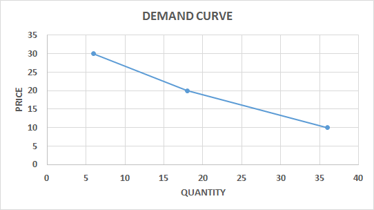
This method is useful in taking general pricing decisions. Data are collected through surveys in which each respondent is asked about his intention to purchase and shown several prices that move up or down depending on the previous answers. Alternatively, prices can be shown randomly or in a fixed series. The highest price at which a respondent reports that he would buy is considered to be his WTP. Once we have a specific price limit (WTP) for each interviewee, we can draw an accumulated demand curve.
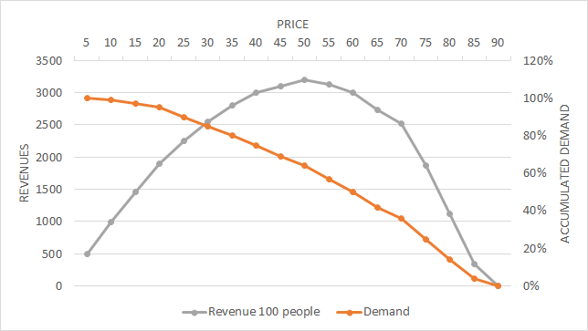
Since we have the information about demand and WTP available, we can calculate the revenue curve in the graph and establish the optimal price at which revenues are maximized (Figure 17 ).
21. VAN WESTENDORP PRICE SENSITIVITY METER
OBJECTIVE
Determine consumer price preferences.
DESCRIPTION
People are asked to define prices for a product at four levels: too cheap, cheap, expensive, and too expensive. The questions usually asked are:
-
At what price would you consider the product to be so expensive that you would not buy it? (Too expensive)
-
At what price would you consider the product to be so inexpensive that you would doubt its quality? (Too cheap)
-
At what price would you consider the product to start to be expensive enough that you could start to reconsider buying it? (Expensive)
-
At what price would you consider the product to be good value for money? (Cheap)
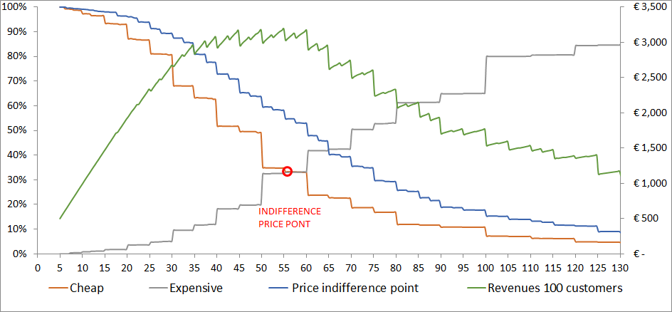
The results are organized by price level, with the accumulated demand for each question. The demand is usually accumulated inversely for the categories “cheap” and “too cheap” to define crossing points with the other two variables (Figure 18 ).
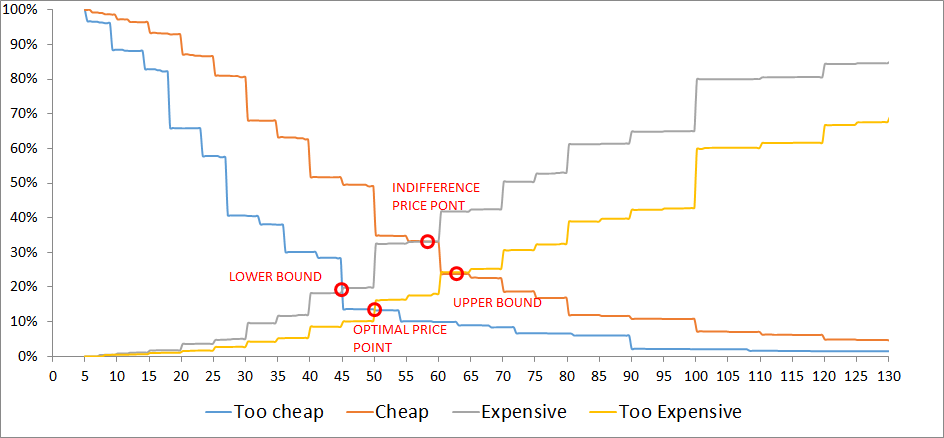
From the four intersections, we have the boundaries between which the price should be settled (lower bound and upper bound). Although the other two price points are sometimes used, I prefer to use this model to define the lead prices and upper prices for a product, while the middle prices should not be static but should change based on several factors (period of purchase, place, conditions, etc.).
With this model we can define price boundaries, but we cannot estimate the purchase likelihood or demand. For the estimation of the demand (and revenues), we ask an additional question regarding the likelihood of buying the product at a specific price with a five-point Likert scale (5 = strongly agree, 1 = strongly disagree). The price to be tested can be the average of the “cheap” price and the “expensive” price for each respondent. A more comprehensive approach would be to ask the question for both the “cheap” and the “expensive” price. Then the results must be transformed into purchase probabilities, for example strongly agree = 70%, agree = 50%, and so on. With these results we can build a cumulative demand curve and a revenue curve (Figure 19 ). The optimal price is the one at which the revenues are maximized (be aware that this approach aims to maximize revenues and does not take into account any variable costs).
22. MONADIC PRICE TESTING
OBJECTIVE
Analyze people’s purchase intention at different price points and for alternative products.
DESCRIPTION
In monadic price testing, purchase behavior is tested for several price points, but each respondent is shown just a single price. Due to this method, a large base of respondents is necessary. A variation that needs a smaller sample is sequential monadic testing, in which the respondents are shown different price points, one at a time (usually no more than three price points are presented to each respondent). It is important to bear in mind that sequential monadic testing implies some biases and usually shows a higher purchase intention at the lower prices than monadic testing.
This is probably the best method for analyzing purchase behavior at a given price; however, it is only useful if we have an idea of the appropriate price points for a particular market. If this is not the case, we would need to obtain this information prior to the analysis, either through direct or indirect survey methods (see 18. INTRODUCTION).
Once the data have been collected, we can summarize the purchase behavior for the different price points (e.g. 11% of the market would purchase the product at €30, €32% at 20, etc.), and we can estimate a demand curve. The data are usually collected through surveys but can also be obtained from controlled experiments.
23. CONJOINT ANALYSIS
OBJECTIVE
Identify customers and potential customers’ preferences for specific attributes of a product. It can also be used to define the willingness to pay and the market share of different products.
DESCRIPTION
Conjoint analysis is a surveying technique used to identify the preferences of customers or prospective customers. The respondents are shown several products with varying levels of different attributes (e.g. color, performance) and are asked to rank the products. This ranking is then used to calculate the utility of each attribute and product at the individual level. The results can be used to define the best combination of attributes and price or to simulate market share variations with competitors (if competitors’ products are presented).
First of all it is very important to spend enough time designing the analysis, starting with the selection of the most important attributes and attributes’ levels.
There are three kinds of methods:
-
Decompositional methods: the respondents are presented with different product versions, they rank them, and then the utilities are calculated at the attribute level by decomposing the observations;
-
Compositional methods: the respondents are asked to rate the different attributes’ levels directly;
-
Hybrid methods: compositional methods are used in the first phase to present a limited number of product versions in the second phase (they are useful when we have a large combination of attributes and levels).
In addition to the methods described above, several kinds of adaptive conjoint analysis are used to increase the efficiency of conjoint analysis, especially when the number of attributes is large.
In conjoint analyses the price is usually included as an attribute and the price utility is calculated. However, this creates several problems:
-
By definition the price has no utility but is used in exchange for the sum of attributes’ utilities of the product;
-
The price ranges, number of levels, and perception of the respondents can bias the answers;
-
The purchase intention is not included, so we do not know whether the respondent would actually buy the product at the presented price (to avoid this problem partially, the respondents are usually asked to define a limit in the ranking below which products are not purchased).
The willingness to pay is calculated as the exchange rate between price utility and attribute utility. However, to avoid the abovementioned problems, we should consider a different approach, for example dividing the analysis into two phases:
-
Perform a classic conjoint analysis for non-price attributes to define utilities;
-
Ask for the purchase intention of full product profiles with varying prices to define the lower and upper boundaries between which the respondent would agree to purchase the product.
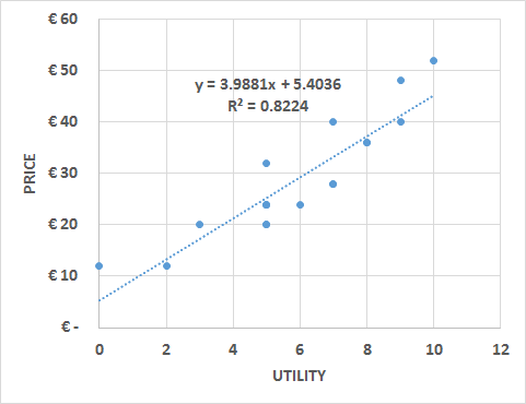
With this information a linear function can be estimated in which the price is the dependent variable and the utility is the independent variable.
In the example we present a classic conjoint analysis that includes the price as an additional attribute. It includes one three-level attribute, one two-level attribute (color), and three levels of price. Full-profile products are presented to the respondents and they are asked to give a preference on a scale from 0 to 10 (10 being the most preferred product) instead of ranking the products.
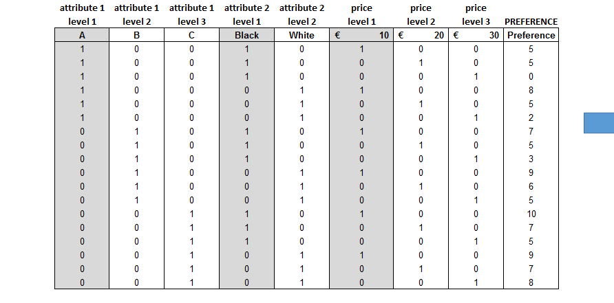
The utility of a respondent is calculated by removing one level for each attribute to perform a multiple linear regression with dummy variables. The removed variables will have a utility of “0,” while the attributes included in the regression will have the utility corresponding to the regression coefficients. After verifying the significance of each attribute (p-value < 0.05; see 38. LINEAR REGRESSION ), the coefficients can be summed to build the utility equation.
The utility equation at the individual level can be used to define the most profitable combination of attributes and price. It also allows the building of scenarios in which shifts in the market share are calculated due to changes in the price or products’ attributes compared with the products offered by competitors. Especially for the market share scenarios, it is important to define the purchase intention by asking the respondents to state a “limit” beyond which they will not purchase the product.
In the template a second sheet is presented in which the price is not included as an additional attribute but the respondents are asked about it separately, either directly or by showing them different price–product combinations and asking for their purchase intention. The last example usually performs better, but if we have numerous combinations, we cannot show all of them.
There are two main approaches when creating surveys for conjoint analysis:
-
Classic conjoint: the respondents are shown all the combinations of attributes’ levels and are asked either to rank them or to define their preferences on a certain scale (e.g. 0 to 10). If the number of combinations is too large, we should either split the combinations and present them several times to the respondents or present only a certain percentage of all the possible combinations (randomly selected). We should also ask for a “limit,” that is, the ranking position or preference level at which the respondent would change his purchase intention.
-
Conjoint in which the price is not an attribute: the process is the same as the classic conjoint analysis, but the price is not included as an attribute. After asking the respondents to rank or set their preferences concerning several combinations of attributes’ levels, they are asked whether they would purchase a specific combination at a specific price. Depending on the response, either the utility or the price is modified to identify the WTP. If the number of combinations is limited, each one can be tested; if the number is large, not all combinations can be tested and the WTP must be calculated for different levels of utility and can then be estimated for all the combinations.
24. CHOICE-BASED CONJOINT ANALYSIS
OBJECTIVE
Identify customers and potential customers’ preferences for specific attributes of a product. It can also be used to define the willingness to pay and market share of different products.
DESCRIPTION
This method is preferred to conjoint analysis because it represents a more realistic purchase situation and, in the case of having a large number of possible combinations, because it is sufficient to show only a certain number of combinations to each respondent. Then the responses are analyzed together and the utility is defined at the aggregated level (not at the individual level as in conjoint analysis).
For this method it is also very important to choose carefully the attributes (as a rule of thumb, no more than seven including the price) and the product profiles to present, that is, the combinations of attributes. Once the attributes and product profiles have been defined, choice scenarios are designed. A scenario is a combination of several products that is presented to the respondents. When defining scenarios, these recommendations should be followed:
-
A “none” choice should be included among the products presented in each purchase scenario;
-
Each scenario should not have more than 5 products;
-
Between 12 and 18 scenarios are usually presented to each respondent.
Usually, all the combinations cannot be presented in the same scenario, and a good practice is to show from two to five products in each scenario. When choosing the combination of products for each scenario, it is important that all the products are shown an equal number of times and that each product is compared equally with other alternatives.
Once the data have been collected, utilities are estimated at the aggregate level. The market share of each product can be calculated using the “share of preferences”:
-
Products’ utilities are calculated by summing all the attributes’ utilities;
-
Products’ utilities are exponentiated;
-
The market share is calculated as the product’s exponentiated utility divided by the sum of all the exponentiated utilities.
To obtain utilities at the individual level, a method called “hierarchical Bayes” is used. This method enables us to calculate a more reliable market share based on the choice of each respondent using three main techniques:
-
First choice: each respondent chooses the product that maximizes her utility (this technique is suggested for expensive products that imply a careful evaluation, such as houses and cars);
-
Share of preference: each respondent purchases a share of each product based on the share of utilities (suggested when a product is purchased several times during a certain period);
-
Randomized first choice: each respondent chooses one product with a probability proportional to its utility.
This method is also useful for predicting variations in the market share compared with competitors by creating simulations in which prices or other products’ attributes are changed. For example, we can analyze whether a discount can attract a big enough market share to compensate for the reduction in price. In this kind of simulation, we assume that competitors are not modifying both attributes and price, but in reality this could not be the case. This is why we should at least simulate several scenarios including possible competitors’ reactions. A more complex approach would be to include a game theory model (see 76. GAME THEORY MODELS ).
Choice-based conjoint is not included as a single Excel file here; use specialized software or complements. XLSTAT CBC example
25. Customer analytics overview
Unlike the other models described in this book, customer analytics analyzes, predicts, and prescribes at the very individual level. The main idea is that a company has at its disposal “customer equity,” which is the sum of the values of each customer. This value is determined by several clients’ behavior, such as the amount spent, purchase frequency, level of recommendation, and so on.
Customer analytics allows companies to segment their customer base properly and personalize products and services for each group of clients or even each individual client. Personalization enables them to retain their most valuable customers and increase customers’ value by properly implementing commercial techniques, such as upselling, cross-selling, recommendation programs, and so on.
Data at the individual level are more complicated to obtain and more complex to analyze than aggregated data. The majority of this information comes from historical market data (a company’s data concerning purchases, customers’ actions, and profiling data), but they are usually complemented with survey data.
26. RFM MODEL
OBJECTIVE
Estimate the lifetime value of a customer or group of customers.
DESCRIPTION
This is probably the simplest model for the estimation of customers’ value. In spite of its simplicity, it is also famous for its reliability, which is based on three variables:
-
Recency: the more recent the purchase or interaction, the more inclined the client is to accept another interaction;
-
Frequency: the more times a customer purchases, the more valuable he or she is to the company;
-
Monetary value: the total value of a customer also depends on the amount spent in a given period.
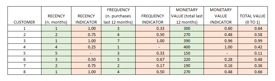
Usually, these three variables are transformed into comparable indicators (for example into a “0 to 1” indicator) and summed up to obtain a total value indicator. We can also define different weights for each indicator.
27. CUSTOMER LIFETIME VALUE 1
OBJECTIVE
Estimate the lifetime value of a customer or group of customers.
DESCRIPTION
Customer lifetime value is an indicator that represents the net present value of a customer based on the estimated future revenues and costs. The main components of this calculation are:
-
Average purchase margin (revenue – costs);
-
Frequency of purchase;
-
Marketing costs;
-
Discount rate or cost of capital.
There are several ways to calculate it, and different formulas have been proposed. The most difficult part is to estimate customers’ retention (in contractual settings) or repetition and to estimate the monetary amount that a customer will spend in the future. It is important to remember that CLV is about the future and not the past, which is why using past data of a customer is not the best method for calculating CLV. A good practice is to segment customers and estimate the retention and spending patterns based on similar customers. Then, the following formula can be applied:
CLV = MC × r / (1 + d − r) − CA
CLV = customer lifetime value
MC = yearly marginal contribution, that is to say the total purchase revenue in a year minus the unit costs of production and marketing
R = retention rate (yearly)
D = discount rate
CA = cost of acquisition (one-time cost spent by the company to reach a new customer)
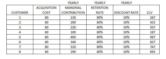
The discount rate can be the average cost of capital for the company or the related industry, and it is used to depreciate the value of future benefits to estimate what they are worth today.
With this formula we can estimate the CLV of a single customer or a segment of customers. In the case of estimating it at the individual level, we should use the retention rate (r) of similar customers, for example customers who buy similar products, or more sophisticated techniques, for example cluster analysis.
When we define the value of a customer or a group of customers, we can make decisions concerning the level of attention, the investment in marketing and retention costs, or the amount that we can spend (cost of acquisition) to attract customers with a similar CLV.
Even though it is quite difficult to estimate, we have to consider that the CLV formula does not take into account the value generated by referrals. Although some formulas have been proposed,[^16] this calculation is seldom used due to the lack of information. In fact, to calculate the customer referral value, we need information about the advocates and the referred customers, and for the latter we should be able to distinguish those who would have made the purchase anyway (without the referral). As a proxy we can use the NPS (see 29. NET PROMOTER SCORE^®^ (NPS^®^) ) combined with other information from surveys, such as asking whether a customer has been referred and how much the referral has affected the purchase.
The market’s historical data is the main source of information (at the individual level, usually from CRM systems), but it can be enriched with survey data, for example concerning the likelihood of repeating the purchase or recommending the product.
28. CUSTOMER LIFETIME VALUE 2
OBJECTIVE
Estimate the retention and future spending amount of customers.
DESCRIPTION
In the previous chapter I explained the principles of CLV and its calculation. However, one of the problems was the estimation of the retention rate (for which the simplification was to apply the average retention rate of similar customers) and future spending amounts (we assumed that the average spending amount of each customer will not change in the future). Despite the facility of the implementation of this approach, it can be much too simplistic and fail to estimate CLV reliably.
There are several methods for estimating retention and spending amounts, but some of them can be far too complex. The method that I will propose has a good balance between accuracy and implementation simplicity and is based on customer segmentation and probability.
The first step is to take the customer data of year -2 and segment them based on their value and their activeness. For the value we can use the amount spent in a specific year (which is a mix of the average amount spent per purchase and the frequency of purchases), and for activeness we can use the recency of the last purchase (for example the number of days between the last purchase and the end of the analyzed year). For activeness we can also use a mix of recency and frequency. In the second step, we have to define a certain number of customer segments. The segmentation technique can be either a simple double-entry matrix or a statistical clustering technique. We can for example end up with six clusters:
-
Active high value
-
Active low value
-
Warm
-
Cold
-
Inactive
-
New customers
The idea behind this technique is to estimate the retention and spending amount using the probability of a customer remaining in the same segment or changing segment and by applying to this customer the average spending amount of the new segment. To calculate the probability of moving from one segment to another, it is necessary to segment the customers into year -1 and create a transition matrix (transition among different segments from year -2 to year -1) in which probabilities are calculated for each combination of segment groups.
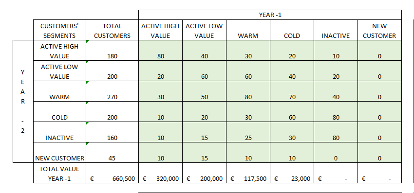
With the probability transition matrix we can simulate how the segments will change in the future and maybe realize that we are dangerously reducing active customers in favor of inactive ones and that we need to acquire a slightly bigger number of each kind of customer to avoid a decrease in profits. In any case with this matrix we can simulate several years ahead and estimate how many customers will still be active. We can also estimate their value by multiplying the average value of each segment by the number of customers of the same segment in a specific year (year 0, year +1, year +2, etc.).
In the proposed template, I have added an estimation of new customers acquired each year to simulate the total number of customers and their value a few years ahead. However, to calculate the CLV of the current customers, this value should be set to 0 and then the total value of each year discounted by the discount rate.
29. NET PROMOTER SCORE^®^ (NPS^®^)
OBJECTIVE
Identify customers’ likelihood of making recommendations.
DESCRIPTION
Usually the value of customers is calculated using only the variables amount spent and frequency of purchases. However, customers can create value in several other ways, one of which is by recommending the service to other potential buyers. The so-called “word-of-mouth” phenomenon is nowadays empowered by social networks, metasearch websites, or portals that provide customer feedback on products.
Positive recommendations can not only increase sales but also allow companies to save money on advertising. The Net Promoter Score® is an indicator that estimates the probability of recommendation of a group of customers based on the recommendation intention of single customers. It was developed and registered as a trademark by Fred Reichheld, Bain & Company, and Satmetrix.
The data are collected through surveys, and the respondents are asked to score from 0 to 10 the likelihood of recommending the product or service. Those who respond 9 or 10 are the real promoters, while those who respond 6 or lower are the detractors. The respondents whose score is from 7 to 8 are considered passive, since, even if they say that they would recommend the product or service, in reality they do not recommend it. The NPS® is the percentage of promoters minus the percentage of detractors.
30. CUSTOMER VALUE MATRIX
OBJECTIVE
Identify customer segments according to the value that they provide to the organization.
DESCRIPTION
A particularly interesting article published in the Harvard Business Review[^17] states that the customers who buy the most are not necessarily the most valuable customers, since, according to the authors, the most valuable customers are those who are able to bring in new valuable clients through recommendations. The referral value of customers includes not only the value generated by the new customers but also the savings on the acquisition costs (advertising, discounts, etc.). In this article both customer lifetime value and customer referral value are calculated properly, but usually these data are hardly available, mainly due to the fact that identifying those customers who made recommendations and the new customers obtained thanks to the recommendations is a complex task.
However, we can take the customer value matrix based on their conclusions and apply it to our customer data in a simpler way. For this simplification we assume that “repetition” is correlated with “lifetime value” and that the intention to recommend a product is correlated with new customers gained through advocacy. These data can be gathered through a survey in which we ask about repetition (actual or intended) and whether the customer would recommend the product. With the results of these two variables, we create a four-block matrix:
-
Champions: they are high buyers and good advocates;
-
Affluents: they are high-spending customers but do not tend to make recommendations;
-
Advocates: they are the customers who make the most recommendations but do not buy a lot;
-
Misers: they are low-value customers in both purchasing and recommending.
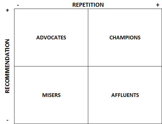
To assign customers to the right box, we can take the median of the two indicators. The purpose of this model is to differentiate our marketing techniques:
-
Affluents: offer them incentives in exchange for recommending products to a few friends;
-
Advocates: focus on upselling or cross-selling, for example by offering bundled products or discounts for products that they are not buying;
-
Misers: try the two abovementioned techniques to move them either to the affluents or to the advocates (or maybe to the champions).
We can also improve the model by adding a value component besides the repetition, for example the money spent on average for each purchase.
A drawback of using this simplification is that we must be able to relate the survey to a real customer to differentiate our marketing techniques. Hotels, for example, use check-out surveys and ask their customers about repetition and recommendation.
The data are gathered through online or offline surveys in such a way that the survey can be related to a customer (through email, transaction identification number, etc.).
31. CUSTOMER PROBABILITY MODEL
OBJECTIVE
Predict the long-term future behavior of customers.
DESCRIPTION
Customer behavior can be predicted by regressions or willingness-to-pay methods; however, while these methods are good at predicting actions for “period 2,” the more we try to predict further into the future, the more these methods are inaccurate. A customer probability model can help in refining the customer lifetime value calculation.
To move beyond “period 2,” we should use a probabilistic model based on pattern recognition. Quite a simple model that can be implemented in Excel is the “Buy Till You Die” model,[^18] which needs three inputs: recency, frequency, and the number of customers for each combination of the previous two variables.
This model can be applied in discrete-time settings, which means that it can be applied either to cases in which the customer can buy a product on specific purchase occasions (for example when participating in an annual conference) or to cases in which a discrete purchase interval is created (time can be “discretized” by a recording process, for example whether or not a customer went on a cruise or stayed at a specific hotel during a year).
The model proposed by Peter S. Fader and Bruce G.S. Hardie^18^ uses a log-likelihood function estimated using the Excel plug-in Solver. They explain how to build the model from scratch and provide an Excel template (see the template link below) in which in the last sheet they preset the DERTs (discounted expected residual transactions), which are “the expected future transaction stream for a customer with purchase history.”
This model uses historical transactional data of the company at the individual level. These data are usually stored in CRM systems.
Buy Till You Die template (authors)
32. SURVIVAL ANALYSIS
OBJECTIVE
Estimate the expected time for an event to occur.
DESCRIPTION
Survival analysis is used for example in medicine (the survival of patients), in engineering (the time before a component breaks), or in marketing (the customer churn rate) to estimate when an outcome will occur. When undertaking this kind of analysis, it is important to consider the concept of “censoring,” that is, the issue that values are only partially known. This is due to the fact that, at the moment of the measurement, for some individuals (or objects) the event has already occurred but for others it has not.
Two of the most-used techniques are the “Kaplan–Meier” method and the Cox regression. The first one is a non-parametric statistical technique that is used when we have categorical variables or the number of observations is small. The example developed in the template uses this technique to estimate the probability of a mechanical component surviving (not breaking) after a certain number of years. Figure 27 shows the survival curve chart, which depicts the survival function.
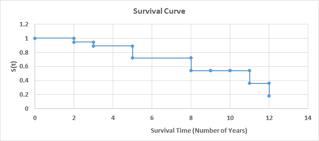
In addition to the survival curve chart, a life table can be used to analyze the results. This table contains the number of years, number of events, survival proportion, standard error, and confidence intervals. In the case in which we need to compare the survival function of two groups, we can use the log-rank test to verify whether the two curves are significantly different.
If the number of observations is large and we want to include additional explanatory variables, then we should use a Cox regression.
Survival analysis can be very useful when we need to prioritize efforts. For example, we can estimate when employees are about to leave the company using a Cox regression with several explanatory variables (years in the company, number of projects, satisfaction, performance, etc.). We can then create a matrix using the survival function on one side and performance on the other side and focus our efforts on those who present both a high performance level and a high probability of leaving.
For this kind of analysis we need a specific tracking of the “survival time” of the concerned object. We can also obtain this data in a CRM, for example concerning subscriptions and unsubscriptions of customers to a certain service.
33. SCORING MODELS
OBJECTIVE
Define the priority of action concerning customers, employees, products, and so on.
DESCRIPTION
Scoring models help to decide which elements to act on as a priority based on the score that they obtain. For example, we can create a scoring model to prevent employees leaving the company in which the score depends on both the probability of leaving and the performance (we will act first on those employees who have a higher probability of leaving and are important to the company). Scoring models are also quite useful in marketing; for example, we can score customers based on their probability of responding positively to a telemarketing call and, based on our resources, call just the first “X” customers.
The model that I will propose concerns a scoring model of customers’ value based on the probability of purchasing a product and on the amount that they are likely to spend. This model is the result of two sub-models:
-
Purchase probability: We will use a logistic regression to estimate the purchase probability of a customer in the next period (see 26. RFM MODEL and 60. LOGISTIC REGRESSION );
-
Amount: We will use a linear regression to estimate the amount that each customer is likely to spend on his or her next purchase (see 38. LINEAR REGRESSION ).
The first step is to choose the predictor variables. In our case I suggest using recency, first purchase, frequency, average amount, and maximum amount of year -2, but we could try additional or different variables. The target variable will be a binary variable that represents whether the client made a purchase during the following period (year -1). A logistic regression is run with the eventual transformation of variables and after verifying that all the necessary assumptions are met (see 36. INTRODUCTION TO REGRESSIONS and 60. LOGISTIC REGRESSION ).
In the second part of the model, we can use for example only the average amount and the maximum amount of year -2, and the total amount spent in year -1 is used as the target variable. We run a multivariate linear regression with the eventual transformation of the variables, after verifying that all the necessary assumptions are met (see 36. INTRODUCTION TO REGRESSIONS , 38. LINEAR REGRESSION , and 39. OTHER REGRESSIONS ). It is important to note that in this regression we will not use the whole customer database but select only those customers who realized a purchase in year -1.
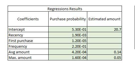
The last step is to put together the two regressions to score customers based on both their purchase probability and the likely amount that they will spend. We use the regression coefficients for the estimates of each customer. In the linear regression, we directly sum the intercept and multiply the variables’ coefficients (Figure 28 ) by the actual values of each customer to estimate the amount.[^19] However, in the logistic regression we should use the exponential function to calculate the real odds of purchasing:
Probability = 1 / (1 + exp(- (intercept coefficient + variable 1 coefficient * variable 1 + variable n coefficient * variable n)))
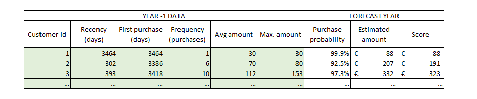
Now that we have two more columns in our database, we just need to add a third one for the final score, which will be the purchase probability times the estimated amount (Figure 29 ). With this indicator we can either rank our customers (to prioritize marketing and resource allocation for some customers) or use this indicator to estimate next-period revenues.
Statistical analysis
34. Statistical analysis overview
Several statistical analyses can be applied to data to answer different business questions. It is important to know when to apply which model and what the limitations are, but there are two important principles when performing statistical analysis:
-
Context: this means understanding the data, the goal of the model, the exactitude needed for the results, whether or not we need to use all the data set or just a portion of it, etc.
-
Segmentation: this refers to segmenting the data to fit the model better.
In the following chapters I will start by explaining how to perform a descriptive statistics analysis of a variable and then I will explain several analysis techniques, which can be grouped into three main categories:
-
Regressions: the analysis of the relationship between different variables and the creation of models in which unknown values of an outcome variable are estimated using one or more predictor variables;
-
Hypothesis testing: the analysis of the differences between groups based on one or more variables of interest;
-
Classification models: models of which the outcome is membership of a group.
Sometimes several models can be used for the same business issue, and the choice will depend on the kind of variables that we are using (categorical, ordinal, or quantitative) and their distribution.
Once the model has been chosen, the next steps are to check the conditions, carry out the analysis, check the significance and fit, validate, and refine.
An important part of statistical analysis consists of manipulating data to prepare it for the model implementation:
-
Outliers can significantly bias results, so we have three options:
-
Maintain the outlier: in the case that we verify that the value is correct;
-
Elimination: in the case that the outlier is an error;
-
Transformation: in the case that we can correct the error and replace it with the correct value;
-
-
Registers with missing data cannot be used in some statistical methods, such as regressions:
-
Leave missing values if we are using a model that is not affected by them, if the number of affected registers is small, or if we cannot replace them with appropriate values;
-
Replace missing values using a prediction method (we can use a simple average or a more complex method).
-
-
Data binning is necessary when a variable has too many categories and we need to group them, for example to analyze their distribution;
-
Variable transformation can be necessary either to meet the requirements for the implementation of a specific model or to improve the model outcome.
There is a useful website that shows step by step how to create statistical analysis models in Excel: http://blog.excelmasterseries.com/ .
35. DESCRIPTIVE STATISTICS
OBJECTIVE
Analyze the distribution of one or several variables in a data set.
DESCRIPTION
In statistical analysis the first step is to analyze the available data. This step is also useful to check for outliers or for the assumption of normality to use these data for a particular statistical model or test (see 36. INTRODUCTION TO REGRESSIONS ). Since the analysis of these assumptions is included in the chapter introducing regressions, here I will focus on the descriptive statistics that are useful for describing numeric variables:
Statistic Description
Mean Arithmetic mean of the data
Standard Error Represents the difference between the expected value and the actual value
Median Central value (the value that divides the data in two – in the case of an even number of values, the median is the mean of the two central values)
Mode Most frequent value
Standard Deviation A measure of how values are spread out. Mathematically, it is the square root of the variance
Sample Variance Average of the squared differences between each value and the mean (it is also a measure of how values are spread out)
Kurtosis A measure of the “peakedness” and flatness of the distribution. “0” means that the shape is that of a normal distribution, a flatter distribution has negative kurtosis, and a more peaked distribution has positive kurtosis
Skewness A measure of the symmetry of the distribution. “0” means that the distribution is symmetrical. If the value is negative, the distribution has a long tail on the left, and if it is positive, it has a long tail on the right. As a rule of thumb, a distribution is considered to be symmetrical if the kurtosis is between 1 and -1
Range The difference between the largest and the smallest value
Minimum The smallest value
Maximum The largest value
Sum The sum of values
Count The number of values
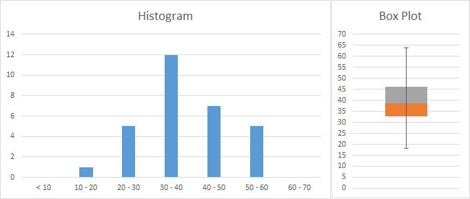
As shown in the template, these statistics can be calculated either using the Excel complement “Data Analysis” or using the Excel functions. The same is valid for creating a histogram, with which we can analyze the frequency of values and gain an idea of the type of distribution. In Figure 30 a sample including age data is represented in a histogram. On the right a box plot provides more information, dividing our data into quartiles (grouping the values into 4 groups containing 25% of the values). The plot shows that 50% of people are aged approximately between 33 and 46 years, while the rest are spread across a bigger range of ages (25% from 46 to 64 and 25% from 18 to 33).
In the template we can see how the two graphs have been created. For the histogram we need to decide which age groups we want to use and fill a table with them. Then we can use the formula “=FREQUENCY” by selecting all the cells on the right of the age groups and pressing “SHIFT + CONTROL + ENTER,” and the formula will provide the frequencies. For the box plot we have to make some calculations and perform some tricks using a normal column chart if we have an older version than Excel 2016. The template and several tutorials can be consulted on the Internet.
Finally, we may have to identify which kind of distribution our data approximate the most (for example to conduct a Monte Carlo simulation). There is no specific method, but we can start by using a histogram and comparing the shape of our data with the shapes of theoretical distributions. The following URL provides 22 Excel templates with graphs and data of different distributions: http://www.quantitativeskills.com/sisa/rojo/distribs.htm .
If our variables are categorical, we can analyze them using a frequency table (count and percentage frequencies). We can also analyze the distribution of frequencies. In the case that our variables are ordinal, we should use the same method for categorical variables (for example if the categories are the answer to a satisfaction question with ordinal answers like “very bad,” “bad,” etc.). However, in some cases we may want to analyze ordinal variables with statistics used for numerical ones (for example, if we are analyzing answers to a question about the quality of services on a scale from 1 to 10, it can be interesting to calculate the average score, range, etc.).
36. INTRODUCTION TO REGRESSIONS
Regressions are parametric models that predict a quantitative outcome (dependent variable) from one or more quantitative predictor variables (independent variable). The model to be applied depends on the kind of relationship that the variables exhibit.
Regressions take the form of equations in which “y” is the response variables that represent the outcome and “x” is the input variable, that is to say the explanatory variable. Before undertaking the analysis, it is important that several conditions are met:
-
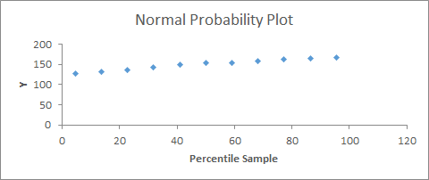
Y values must have a normal distribution: this can be analyzed with a standardized residual plot, in which most of the values should be close to 0 (in samples larger than 50, this is less important), or a probability residual plot, in which there should be an approximate straight line (Figure 31 );
-
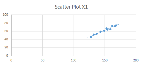
Y values must have a similar variance around each x value: we can use a best-fit line in a scatter plot (Figure 32 );
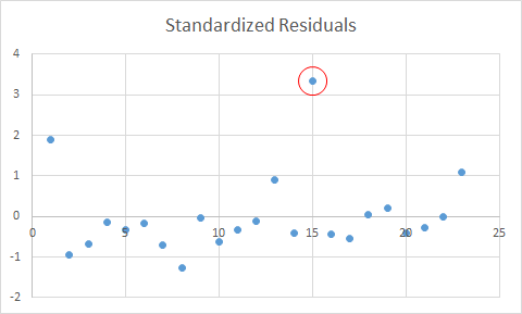
-
Residuals must be independent; specifically, in the residual plot (Figure 33 ), the points must be equally distributed around the 0 line and not show any pattern (randomly distributed).
If the conditions are not met, we can either transform the variables[^20] or perform a non-parametric analysis (see 47. INTRODUCTION TO NON-PARAMETRIC MODELS ).
In addition, regressions are sensitive to outliers, so it is important to deal with them properly. We can detect outliers using a standardized residual plot, in which data that fall outside +3 and -3 (standard deviations) are usually considered to be outliers. In this case we should first check whether it was a mistake in collecting the data (for example a 200-year-old person is a mistake) and eliminate the outlier from the data set or replace it (see below how to deal with missing data). If it is not a mistake, a common practice is to carry out the regression with and without the outliers and present both results or to transform the data. For example, we may apply a log transformation or a rank transformation. In any case we should be aware of the implications of these transformations.
Another problem with regressions is that records with missing data are excluded from the analysis. First of all we should understand the meaning of a missing piece of information: does it mean 0 or does it mean that the interviewee preferred not to respond? In the second case, if it is important to include this information, we can substitute the missing data with a value:
-
With central tendency measures, if we think that the responses have a normal distribution, meaning that there is no specific reason for not responding to this question, we can use the mean or median of the existing data;
-
Predict the missing values using other variables; for example, if we have some missing data for the variable “income,” maybe we can use age and profession to for the prediction.
Check the linear regression template (see 38. LINEAR REGRESSION ), which provides an example of how to generate the standardized residuals plot.
37. PEARSON CORRELATION
OBJECTIVE
Find out which quantitative variables are related to each other and define the degree of correlation between pairs of variables.
DESCRIPTION
This method estimates the Pearson correlation coefficient, which quantifies the strength and direction of the linear association of two variables. It is useful when we have several variables that may be correlated with each other and we want to select the ones with the strongest relationship. Correlation can be performed to choose the variables for a predictive linear regression.
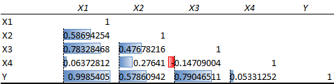
With the Excel Data Analysis complement, we can perform a correlation analysis resulting in a double-entry table with correlation coefficients (Pearson’s coefficients). We can also calculate correlations using the Excel formula “=CORREL().” The sign of the coefficient (Pearson correlation coefficient) represents the direction (if x increases then y increases = positive correlation; if x increases then y decreases = negative correlation), while the absolute value from 0 to 1 represents the strength of the correlation. Usually above 0.8 it is very strong, from 0.6 to 0.8 it is strong, and when it is lower than 0.4 there is no correlation (or it is very weak).
Figure 34 shows that there is a very strong positive correlation between X1 and Y and a strong positive correlation between X1–X3 and X3–Y. X3 and X4 have a weak negative correlation.
38. LINEAR REGRESSION
OBJECTIVE
Define the linear relationship between an input variable (x) and an outcome variable (y) to create a linear regression predictive model.
DESCRIPTION
The equation for a linear regression is:
Y = α + βx
where $\ y$ is the outcome variable, α is the intercept, β is the coefficient, and x is the predictor variable. This model is used to predict values of y for x values that are not in the data set or, in general, how the outcome is affected when the input variable changes. For example, such a model can predict how much sales would increase due to an increase in advertising spending.
In a linear regression we can only use numerical variables, which are either discrete or continuous. We can include categorical variables by transforming them into dummy variables (a categorical variable with four categories is transformed into three variables of two values, 0 and 1).
After checking the conditions (see 36. INTRODUCTION TO REGRESSIONS ), the linear regression can be carried out using the Data Analysis Excel complement (Figure 35 ) or by using Excel statistical formulas such as “=CORREL()” for R, “=INTERCEPT()” for the intercept coefficient, and “=LINEST()” for the X coefficient (and other statistics). If a scatter plot containing both variables seems to indicate that the relationship is not linear, we can either transform the independent variable (log, power, etc.) or try using a non-linear regression (39. OTHER REGRESSIONS ).
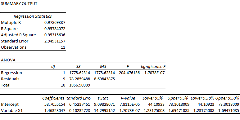
There are three main outputs from this analysis:
-
P-value: the model is valid if the p-value of both the intercept and the X variable are below 0.05 (or another chosen alpha value). In the case that the intercept has a higher p-value, we can set the intercept to 0 before carrying out the regression;
-
R^2^: this is a measure of how much the variability of y is explained by x; the closer to 1, the more x explains variations in y;
-
Coefficient of X: this defines the direction and the strength of the relationship (see 37. PEARSON ).
It is important to bear in mind that, even if all the conditions are met, we find a strong correlation, and the regression is significant (p-value < 0.5), it does not mean that there is causality. A good example is that we may find a correlation between the number of ice creams consumed and the number of people drowning in swimming pools, but that does not mean that one is caused by the other. It is important to discard the hypothesis of a third common variable that is causing the variations in x and y.
39. OTHER REGRESSIONS
OBJECTIVE
Define the relationship between one or more input variables (x) and an outcome variable (y) to create a regression predictive model.
Each of the following regressions needs to meet the same conditions as those mentioned in 36. INTRODUCTION TO REGRESSIONS . In addition, we need to perform the same analysis of outliers and missing data.
MULTIVARIATE REGRESSION
This linear regression is used when we have several predictor variables. In this case we need to check the p-values of all the predictor variables. We may need to exclude variables with a high p-value (> 0.5). It is apparent that the more the number of predictor variables increases, the higher the R^2^, but it does not mean exclusively that the model is better. With multivariate regressions we should check the adjusted R^2^, which takes into account the increasing number of variables. As a general rule, comparing two models with equal or very close adjusted R^2^s, the one with fewer predictor variables should be chosen.
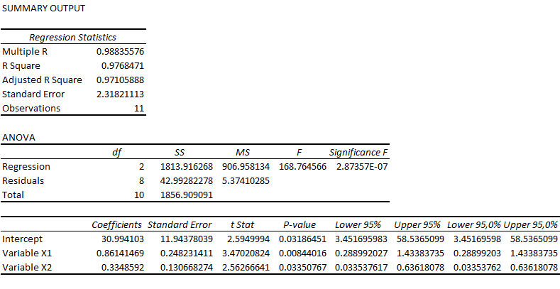
An important issue when using multiple predictor variables is the problem of collinearity. Predictor variables cannot be correlated with one another, so we should perform a correlation analysis and eliminate correlated variables.
In a multivariate regression, we can only use numerical predictor variables; however, there is a transformation that can be used to include categorical variables: dummy coding. Supposing that a categorical variable has k levels, we would create k-1 dummy variables, each with two levels (0 and 1).
In the case of using ordinal input variables, we may choose either to treat them as numerical variables (including them directly in the regression) or to transform them into dummy variables. In the former case, we assume that the distances among the levels are meaningful (e.g. the difference in value from 1 to 2 is the same as the one from 2 to 3). In the case of treating it as a categorical variable, we do not make the previous assumption but lose information about the ordering.
NON-LINEAR REGRESSIONS
The mathematics behind non-linear models is more complex, as is their interpretation and validation. Whenever possible, it is better to use a simple linear regression, and if the pattern in the data changes, we can segment the data to explain the variation with two or more linear regressions. However, if we really think that a non-linear model is necessary to fit the data well:
-
We can use more complete software than Excel (in Excel we can draw a scatter plot with non-linear trend lines, with the equation and R^2^, but for a proper interpretation and validation we should use more professional tools);
-
As a general rule, if we are testing several non-linear models and they are both significant and have a similar R squared, we should choose the less complex one (for example a quadratic one over a cubic one).
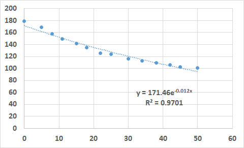
Examples of non-linear regressions are exponential, logarithmic, polynomial, quadratic, cubic, and power. For two-dimension analyses, we can plot our data in a graph such as the one shown in Figure 37 and add a trend line to the graph (in Excel we can try several trend lines and check the R^2^ for the goodness of fit of the line to the data). For regressions with more dimensions or for more robust analyses (including other statistics besides the regression function and R^2^), we should use statistical software.
39 MULTIVARIATE REGRESSION 39 NON-LINEAR REGRESSIONS (EXPONENTIAL)
40. PATH ANALYSIS
OBJECTIVE
Define the direct and indirect effects of input variables.
DESCRIPTION
Path analysis is part of a broader group called SEM (structural equation modeling). SEM uses several models to define the relationships within and between variables. Besides path analysis, this group includes confirmatory factor analysis, partial least squares path analysis, LISREL, and so on.
Path analysis is based on multiple regressions, but it extends further since it allows the interpretation of the relationships within the predictor variables and the dependent variable to be defined. For example, in a multiple regression, we can find that gender, child abuse, and drug use are good predictor variables for suicidal tendencies. However, we suspect that the use of drugs is affected by child abuse. With a path analysis we can define a model (represented by a path diagram) in which we define both direct and indirect effects of the predictor variables on the dependent variable. Consequently, we can better interpret the relationships within and between variables.
STEP 1: MODEL DEFINITION
Even if we can calculate all the relations among variables and then work according to the regression coefficients and correlation coefficients, the recommended approach is first to define a structural model based on our knowledge and to create a path diagram with the hypothesis of relationships between and within predictor and outcome variables.
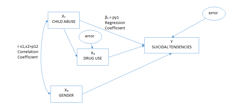
The diagram includes several elements:
-
Observed variables: those variables that are measured and are represented by rectangles;
-
Latent variables: those variables that cannot be measured, for example “errors”[^21] (variances that are not explained by the model), which are represented by circles or ellipses;
-
Regression coefficients: causal relationships between two variables represented by straight arrows (also called path coefficients or direct effects);
-
Correlation coefficients: non-causal relationships between two variables represented by curved arrows.
An important limitation is that the number of free parameters (relations established in the path diagram) has to be lower than the number of distinct values. Distinct values are calculated by the formula p*(p + 1) / 2, where p is the number of variables. The number of free parameters is the sum of all the relations established in the model (put simply, the number of arrows in the path diagram).
To learn more about path analysis and SEM, I suggest referring to the book A Beginner’s Guide to Structural Equation Modeling.[^22]
STEP 2: DATA ANALYSIS
This model requires the same conditions as regressions to be met (see 36. INTRODUCTION TO REGRESSIONS ) and uses a multiple regression and a correlation matrix to find all the parameters of the model. For this step I suggest consulting the paper of Akinnola Akintunde[^23] entitled “Path Analysis Step by Step Using Excel.” To obtain the parameters:
-
Standardize all the variables using the Excel function “=STANDARDIZE” (using the x value, the mean of the variable, and its standard deviation);
-
Run a multivariate regression from which the regression coefficients (considered the direct effects of a certain predictor variable on the dependent variable) will be used;
-
Run a correlation matrix among all the variables (the correlation coefficients will be used for calculating the indirect effects);
-
Errors can be calculated by the formula “1 - R^2^”; however, they are just descriptive parameters and are not used in the actual calculation of relationships.
Now we have all the parameters of the path diagram. We know the direct effects (the correlation coefficients of the multivariate analysis and the correlation between predictor variables) and the non-causal correlation between independent variables. We can also calculate the indirect effects. For example (Figure 39 ), the indirect effect of X1 on Y is “c * b,” while the total effect is “a + c * b.”
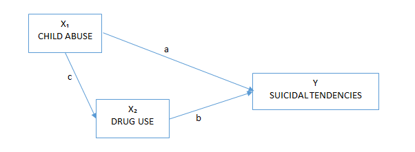
STEP 3: MODEL TESTING AND MODIFICATION
The model can be tested using for example the chi-square test for the “badness of fit” (see 48. CHI-SQUARE ) or other methods (RMSEA or GFI). The recommended values for the model to have a good fit are:
-
Chi-square p-value > 0.05;
-
RMSEA < 0.05;
-
GFI > 0.95.
This Excel template can help in calculating the goodness of fit of SEM models: http://www.watoowatoo.net/sem/sem.html . If the model fitting is not satisfactory, it is necessary to modify the path diagram to seek a better fit by:
-
Eliminating non-significant parameters by checking the t-statistics of parameters (i.e. if they are larger than 1.96);
-
Adding new parameters using two techniques:
-
Modification index: a large value indicates potentially useful parameters;
-
Expected parameter change: approximate value of the new parameter if added;
-
-
Analyzing the standardized residual matrix and checking for values higher than 1.96 or 2.58 (for example), which identify values that are not well accounted for in the model.
RECOMMENDATIONS
Even though it is possible to create simple path analysis models in Excel, my suggestion is to use a proper statistical tool to help to build and calculate the model. The most important part is to understand the reasoning behind this kind of model so that the calculation part can be carried out more quickly and precisely using a proper tool. The associated template will not include the calculation of the model but simply the path diagram presented in this chapter.
41. INTRODUCTION TO HYPOTHESIS TESTING
OBJECTIVE
Verify whether two (or more) groups are significantly different from each other, usually by comparing their means or medians.
DESCRIPTION
Generally speaking, statistical hypothesis testing concerns all the techniques that test a null hypothesis versus an alternative hypothesis. Although it also includes regressions, I will only focus on the testing performed on samples.
There are three main steps in hypothesis testing:
-
Definition: identify the problem, study it, and formulate hypotheses;
-
Experiment: choose and define the data collection technique and sampling method;
-
Results and conclusion: check the data, choose the most appropriate test, analyze the results, and make conclusions.
DEFINITION
The first step in hypothesis testing is to identify the problem and analyze it. The three main categories of hypothesis testing are:
-
to test whether two samples are significantly different; for example, after conducting a survey in two hotels of the same hotel chain, we want to check whether the difference in average satisfaction is significant or not;
-
to test whether a change in a factor has a significant impact on the sample by conducting an experiment (for example to check whether a new therapy has better results than the traditional one);
-
to test whether a sample taken from a population truly represents it (if the population’s parameters, i.e. the mean, are known); for example, if a production line is expected to produce objects with a specific weight, it can be checked by taking random samples and weighting them. If the average weight difference from the expected weight is statistically significant, it means that the machines should be revised.
After defining and studying the problem, we need to define the null hypothesis (H0) and alternative hypothesis (Ha), which are mutually exclusive and represent the whole range of possibilities. We usually compare the means of the two samples or the sample mean with the expected population mean. There are three possible hypothesis settings:
-
To test any kind of difference (positive or negative), the H0 is that there is no difference in the means (H0: μ = μ0 and Ha: μ ≠ μ0);
-
To test just one kind of difference:
-
positive (H0: μ ≤ μ0 and Ha: μ > μ0);
-
negative (H0: μ ≥ μ0 and Ha: μ < μ0).
-
EXPERIMENT
The sampling technique is extremely important; it must be certain that the sample is randomly chosen (in general) and, in the case of an experiment, the participants must not know in which group they are placed. Depending on the problem to be testing and the test to be performed, different techniques are used to calculate the required sample size (check www.powerandsamplesize.com , which allows the calculation of the sample size for different kinds of tests).
RESULTS AND CONCLUSIONS
Once the data have been collected, it is necessary to check for outliers and missing data (see 36. INTRODUCTION TO REGRESSIONS ) and choose the most appropriate test depending on the problem studied, the kind of variables, and their distribution. There are two main approaches to testing hypotheses:
-
The frequentist approach: this makes assumptions on the population distribution and uses a null hypothesis and p-value to make conclusions (almost all the methods presented here are frequentist);
-
The Bayesian approach: this approach needs prior knowledge about the population or the sample, and the result is the probability for a hypothesis (see 42. BAYESIAN APPROACH TO HYPOTHESIS TESTING ).
Tests usually analyze the difference in means, and the result is whether or not the difference is significant. When we make these conclusions, we have two types of possible errors:
-
α: the null hypothesis is true (there is no difference) but we reject it (false positive);
-
β: the null hypothesis is false (there is a difference) but we do not reject it (false negative).
| Do not reject null hypothesis | Reject null hypothesis | |
|---|---|---|
| Null hypothesis is true | Correct inference (probability 1 − α) | Type I error (α) |
| Null hypothesis is false | Type II error (β) | Correct detection (power 1 − β) |
It is important to remember that, if we are running several tests, the likelihood of committing a type I error (false positive) increases. For this reason we should use a corrected α, for example by applying the Bonferroni correction (divide α by the number of experiments).[^24]
In addition, it is necessary to remember that, with an equal sample size, the smaller the α chosen, the larger the β will be (false negative).
If the test is significant, we should also compute the effect size. It is important not only whether the difference is significant but also how large the difference is. The effect size can be calculated by dividing the difference between the means by the standard deviation of the control group (to be precise, we should use a pooled standard deviation, but it requires some calculation). As a rule of thumb, an effect size of 0.2 is considered to be small, 0.5 medium, and above 0.8 large. However, in order contexts the effect size can be given by other statistics, such as the odds ratio or correlation coefficient.
Confidence intervals are also usually calculated to have a probable range of values to derive a conclusion in which there is, for example, 95% confidence that the true value of the parameter is within the confidence interval X‒Y. The confidence interval reflects a specific interval level; for example, a 95% interval reflects a significance level of 5% (or 0.05). When comparing the difference between two means, if 0 is within the confidence interval, it means that the test is not significant.
**
ALTERNATIVE METHODS
In the following chapters I will present several methods for hypothesis testing, some of which have specific requirements or assumptions (type of variables, distribution, variance, etc.). However, there is also an alternative that we can use when we have numerical variables but are not sure about the population distribution or variance. This alternative method uses two simulations:
-
Shuffling (an alternative to the significance test): we randomize the groups’ elements (we mix the elements of the two groups randomly, each time creating a new pair of groups) and compute the mean difference in each simulation. After several iterations we calculate the percentage of trials in which the difference in the means is higher than the one calculated between the two original groups. This can be compared with the significance test; for example, if fewer than 5% of the iterations indicate a larger difference, the test is significant with α < 0.05.
-
Bootstrapping (an alternative to confidence intervals): we resample each of our groups by drawing randomly with replacement from the groups’ elements. In other words, with the members of a group, we recreate new groups that can contain an element multiple times and not contain another one at all. An alternative resampling method would be to resample the original groups in smaller subgroups (jackknifing). After calculating the difference in means of the new pairs of samples, we have a distribution of means and can compute our confidence interval (i.e. 95% of the computed mean differences are between X and Y).
42. BAYESIAN APPROACH TO HYPOTHESIS TESTING
OBJECTIVE
Identify the probability of a hypothesis using the probability of related events.
DESCRIPTION
This probabilistic approach is often used in logic tests, which may require a statement such as the following to be solved:
0.5% of the population suffers a certain disease and those with this disease that take a clinical test are diagnosed correctly in 90% of cases. You also know that you have on average 10% of false positive tests on people who do not have the disease. A person has been diagnosed as positive; what is the probability that he actually has the disease?
This problem is solved by finding the percentage of true positives (the test is positive and the person has the disease) in the total number of positive tests, and it can be approached by drawing the following matrix and calculating the missing percentages (Figure 42 ):
The answer is given by dividing 0.45% by 10.45%, giving a 4.31% possibility of that person being sick. More formally, the problem is resolved by the following equation:
P(A | B) = P(B | A) P(A) / P(B)
where P is the probability, A is having the disease, and B is when the test is positive; therefore, P(A|B) is the probability of having the disease when the test is positive and P(B|A) is the probability of obtaining a positive test when the patient has the disease. The template shows how the values have been calculated starting from the proposed problem.
43. t-TEST
OBJECTIVE
Verify whether two groups are significantly different.
DESCRIPTION
There are three main applications of the t-test:
-
One-sample t-test: compare a sample mean with the mean of its population;
-
Two-sample t-test: compare two sample means;
-
Paired t-test: compare two means of the same sample in different situations (i.e. before and after a treatment).[^25]
To perform a t-test, it is necessary to check the normality assumption (see 36. INTRODUCTION TO REGRESSIONS ); however, the t-test tolerates deviations from normality as long as the sample size is large and the two samples have a similar number of elements. In the case of important normality deviations, we can either transform the data or use a non-parametric test (see Figure 40 in chapter 41. INTRODUCTION TO HYPOTHESIS TESTING ).
An alternative to the t-test is the z-test; however, besides the normality assumption, it needs a larger sample size (usually > 30) and the standard deviation of the population.
Each of the three kinds of t-tests described above has two variations depending on the kind of hypothesis to be tested. If the alternative hypothesis is that the two means are different, then a two-tailed test is necessary. If the hypothesis is that one mean is higher or lower than the other one, then a one-tailed test is required. It is also possible to specify in the hypothesis that the difference will be larger than a certain number (in two-sample and paired t-tests).
After performing the test, we can reject the null hypothesis (there are no differences) if the p-value is lower than the alpha (α) chosen (usually 0.05) and if the t-stat value is not between the negative and the positive t-critical value (see the template). The critical value of t for a two-tailed test (t-critical two-tail) is used to calculate the confidence interval that will be at the 1 minus the α chosen (if we choose 0.05 we will have a 95% confidence interval).
**
ONE-SAMPLE T-TEST
With this test we compare a sample mean with the mean of the population. For example, we have a shampoo factory and we know that each bottle has to be filled with 300 ml of shampoo. To control the quality of the final product, we take random samples from the production line and measure the amount of shampoo.
Since we want to stop and fix the production line if the amount of shampoo is smaller or larger than the expected quantity (300 ml), we have to run a two-tailed test. Figure 43 shows the input data as well as the calculated standard deviation and sample mean, which is 295. A confidence level of 0.05 is chosen. We then calculate the t-critical value and p-value (the formulas can be checked in the template).
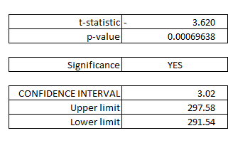
Since the p-value is lower than the alpha (0.05), we conclude that the difference in the means is significant and that we should fix our production line. The results also include the confidence interval of 95%, which means that we are 95% confident that the bottles are filled with a minimum of 292 ml and a maximum of 298 ml.
**
TWO-SAMPLE T-TEST
A practical example would be to determine whether male clients buy more or less than female ones.
First of all, we should define our hypothesis. In our example our hypothesis is that male and female clients do not buy the same amount of goods, so we should use a two-tailed test; that is, we do not infer that one group buys more than the other one. On the other hand, if we would like to test whether males buy more, in this case we would use a one-tailed test.
In the Excel complement “Data Analysis,” we choose the option “t-Test: Two-Sample Assuming Unequal Variances” by default, since, even if the variances are equal, the results will not be different, but if we assume equal variances, than we will have a problem in the results if finally the variances are not equal. We select the two-sample data and specify our confidence level (alpha, by default 0.05).
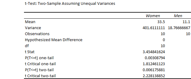
Since we are testing the difference, either positive or negative, in the output, we have to use the two-tailed p-value and two-tailed t-critical value. In this example the difference is significant, since the p-value is smaller than the chosen alpha (0.05).
Confidence intervals are also calculated in the template, concluding that we are 95% confident that women buy between 8 and 37 more products than men.
**
PAIRED T-TEST
We want to test two different products on several potential consumers to decide which one is better by asking participants to try each one and rate them on a scale from 1 to 10. Since we have decided to use the same group to test both products, we are going to run a paired two-tailed t-test. The alpha chosen is 0.05.
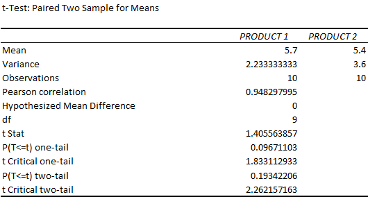
The results of the example show that there is no significant difference in the rating of the two products, since the p-value (two-tail) is larger than the alpha (0.05). The template also contains the confidence interval of the mean difference, which in this case includes 0 since there is no significant difference.
44. TEST OF PROPORTIONS
OBJECTIVE
Verify whether two proportions are significantly different.
DESCRIPTION
This test has the same purpose as a t-test but is applied to compare proportions, that is, when elements can take the value of 0 or 1. For example, we can compare the conversion rate of two advertising campaigns (two-sample test of proportions) or compare the improvement in patients who received a new drug compared with the average improvement of these patients.
As in the t-test, we need to specify our hypothesis and, based on that, run either a two-tailed t-test or a one-tailed t-test (see 43. t-TEST ); the only difference is that instead of using means we use proportions. We then need to specify the required significance level (α) and the hypothesized difference between the proportions.
Other differences from the t-test is that we resolve the test by calculating the z-critical value instead of the t-critical value and that the calculation is slightly different because we use proportions instead of means, variances, and standard deviations. In addition, we have to check that the number of events (conversions) and the number of “no events” (users who did not buy) are at least 10.
ONE-SAMPLE
The boss of a company claims that 80% of people are very satisfied with their working conditions. Our null hypothesis is that the satisfaction is equal to 80%, and our alternative hypothesis is that the satisfaction rate is different from 80%. The HR department decides to survey 100 employees, with a result of 73%. At the 0.05 level of significance, we fail to reject the null hypothesis, so we cannot state that the satisfaction of our survey is significantly different from 80%. In Figure 47 we can see that the confidence interval (95%) includes 80%.
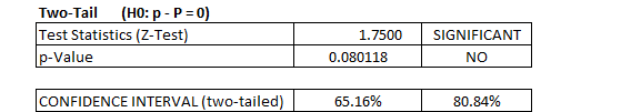
**
TWO-SAMPLE
A company has started a new online marketing campaign and wants to compare it with a standard online marketing campaign. The goal is to increase the conversion rate of online users, and the conversion rates of the two campaigns are compared using a proportion test. The results are not presented here, since this test is explained in more detail in chapter 45. A/B TESTING .
45. A/B TESTING
OBJECTIVE
Test two or more items/objects and identify the one with the best performance.
DESCRIPTION
A/B testing is part of a broader group of methods used for statistical hypothesis testing in which two data sets are compared. Having defined a probability threshold (significance level), we can determine statistically whether to reject the null hypothesis or not. Usually, the null hypothesis is that there is no significant difference between the two data sets.
A/B testing is a randomized experiment with two variants (two-sample hypothesis testing), but we can also add more samples. The difference from multivariate testing is that in A/B testing only one element varies, while in the other test different elements vary and we should test several combinations of elements. These tests are used in several sectors and for different business issues, but nowadays they are quite popular in online marketing and website design.
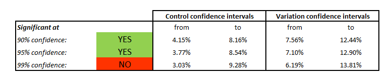
Usually the steps to follow are:
-
Identify the goals: for example “improving the conversion rate of our website”;
-
Generate hypotheses: for example “a bigger BUY button will convert more”;
-
Create variables: in our example the element to be modified is the BUY button and the variation website can be created with a double-size BUY button;
-
Run the experiment:
-
Establish a sample size: depending on the expected conversion rate, the margin of error that is acceptable, the confidence level, and the population, the minimum sample size can be calculated (see the template);
-
The two versions must be shown to visitors during the same period, and the visitors must be chosen randomly (we are interested in testing the effect of a larger button; if we do not choose visitors randomly or show the two versions during different periods, the results will probably be biased);
-
-
Analyze the results:
-
Significance: depending on the significance level chosen for the test (usually 90%, 95%, or 99%), we can be X% confident that the two versions convert differently;
-
Confidence intervals: depending on the confidence level chosen, there will be a probable range of conversion rates (we will be X% confident that the conversion rate ranges from X to Y);
-
Effect size: the effect size represents the difference between the two versions.
-
The proposed template provides a simple calculator for the necessary sample size and for testing the significance of conversion rate A/B testing. However, a considerable amount of information about A/B testing is available online.[^26] The template of chapter 44. TEST OF PROPORTIONS shows the same test with more statistical detail as well as the calculation of the mean difference confidence interval, while the A/B testing template presents confidence intervals for each mean of the two samples.
In the proposed example, the data are obtained using a web analytics tool (for example Google Analytics), but they can come from any experiment that we decide to run.
46. ANOVA
OBJECTIVE
Verify whether two or more groups are significantly different.
DESCRIPTION
While with a t-test we can only test two groups, with ANOVA we can test several groups and decide whether the means of these samples are significantly different. The simplest analysis is one-way ANOVA, in which the variance depends on one factor. Suppose that we want to know whether the age of people buying three different products is significantly different to focus the promotional campaigns better. In this case we have just one factor (type of product); therefore, we run a one-way ANOVA after checking the normality assumption (see 36. INTRODUCTION TO REGRESSIONS ).
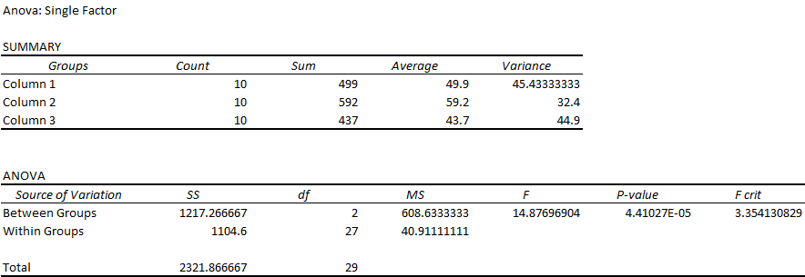
Once the test is concluded, we check the p-value (< 0.05) and F-value (larger than the F-critical value) to reject the null hypothesis and infer that the populations are not equal. In the proposed example, there is a significant age difference among products. However, we should perform a t-test of each pair of groups to determine where the difference lies.
In a two-way ANOVA we have two factors to be tested. For example, we are selling products A, B, and C in three countries (1, 2, and 3). In the proposed example, we use a two-way ANOVA “without replication,” since only one observation is recorded for each factor’s combination (we will use an ANOVA “with replication” if there are more observations recorded for each combination). In a two-way ANOVA, there are two null hypotheses to be tested, one for each factor, and it is possible that the hypothesis will be rejected for one factor but not for the other one.
In our example we reject the null hypothesis for the factor “type of product” (rows), since its p-value is smaller than 0.05, but we cannot reject the null hypothesis for the factor “country” (columns).
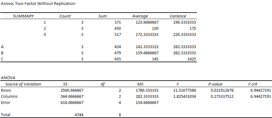
We can also perform an ANOVA with repeated measures when we have repeated measures within the same group. In our example a company decided to start a four-week training program for five employees to diminish the number of errors made at work. In this case the repeated measures are the errors of each employee in the same week of training.
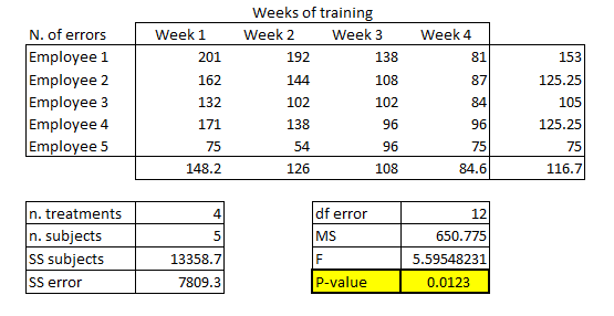
The template contains the calculations for a single-factor repeated-measures ANOVA. In our example, since the p-value is lower than 0.05 (our chosen alpha), we reject the null hypothesis of no difference among the week’s means and infer that the training has had an impact on the number of errors (Figure 51 ).
We can use the Excel Data Analysis complement to perform a two-factor repeated-measures ANOVA, choosing the test “Anova: Two-Factor With Replication.” In the proposed example, we are selling different product versions in different markets, and we want to test whether either the product or the market (or both) have an impact on the number of products sold. The results show that, while the kind of product (rows) affects the sales (p-value < 0.05), the market (columns) does not (Figure 52 ).
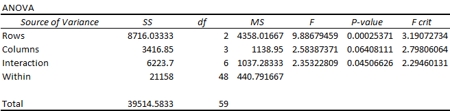
An extension of ANOVA is MANOVA, which allows the test to be run with more than one dependent variable. For example, it is possible to run a MANOVA using “level of education” as the categorical independent variable and “test score” and “yearly income” as the continuous dependent variables.
47. INTRODUCTION TO NON-PARAMETRIC MODELS
Non-parametric models are used as counterparts of parametric models that analyze the correlation or dependence between variables when parametric models’ assumptions are not met: normal distribution, homogeneous variance, ratio or interval variables, and independent data sets.
If the sample size is large enough (i.e. larger than 100), we can use parametric tests even if we are not sure of the normality of the population distribution. If the sample is small and we are not certain of the population distribution, we should use non-parametric tests.
In addition, with ordinal and nominal variables, we cannot conduct parametric tests. In the case of numerical variables that can be ranked (e.g. the satisfaction of clients measured on a 0–10 scale), we usually cannot use them as interval variables, since the distance between the values is not equal along the scale. For example, someone who chose “6” is not necessarily twice as satisfied as someone who chose “3.”
Figure 53 presents a list of the non-parametric tests presented in this book.
| Dependent variable | Sample characteristics (independent variables) | Correlation | ||||
|---|---|---|---|---|---|---|
| 1 sample | Two independent samples | Two dependent (paired) samples | More than two independent samples | More than two dependent samples | ||
| Categorical | Chi-square (χ2) | McNemar test | Chi-square (χ2) | Cochran’s Q | Phi coefficient; contingency tables | |
| Ordinal | Chi-square (χ2) | Mann–Whitney U test | Wilcoxon signed-rank test | Kruskal–Wallis test | Scheirer–Ray–Hare (two-way); Friedman (one-way) | Spearman’s correlation |
48. CHI-SQUARE
OBJECTIVE
Verify whether the difference between the observed frequencies and the expected frequencies is significant or not.
DESCRIPTION
A chi-square test is used to test the frequencies of independent observations (not suitable for paired testing) with two main purposes:
-
Test of independence: to determine the association between two categorical variables, for example if the kind of civil status does not affect the kind of service that customers buy;
-
Test of goodness of fit: to determine the difference between the observed values and the expected values (for example whether a sample taken from a population follows the expected population distribution or a theoretical distribution).
In either case the method used is the same; specifically, we apply a chi-square test using the observed values and the expected values. When using a chi-square test, it is important to bear in mind that this test is sensitive to the sample size (with fewer than 50 this test is not appropriate) and needs to have a minimum frequency in each bin or class (at least 5). If these conditions are not met, we should consider using Fisher’s exact test.
TEST OF INDEPENDENCE
In the example we are testing the independence of the variables “civil status” and “service level” chosen by customers.
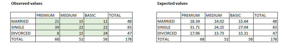
For this test we assume that the probability of having a specific service level and the probability of being married, single, or divorced are independent events. With these assumptions, we compare the actual distribution of the products sold in each country and the expected distribution based on the independent probabilities of the two events (see the template). In other words, the test compares the expected frequencies with the actual frequencies. The Excel formula “=CHITEST” is then applied, and if the resulting p-value is smaller than 0.05 (or a different alpha), we reject the null hypothesis (the two variables are independent) and we can infer that the two variables are associated. In other words, we can say that civil status affects the level of service purchased.
**
GOODNESS OF FIT
Goodness of fit can be calculated in Excel using the same formula (=CHITEST), which is applied to a column (or row) with observed values and a column with expected values. For example, if we throw a die, we expect that each number has the same probability of appearing (1/6) but suspect the die to have been loaded. In our example we throw the die 60 times and expect to produce each number 10 times. If the p-value is lower than 0.05, we reject the null hypothesis, which is that the variables are independent (as in the chi-square independence test). Since the p-value is larger than 0.05, we conclude that the die is not loaded.
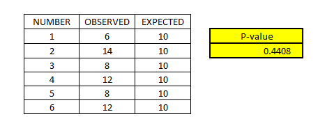
We can also compare our observed values with a theoretical distribution.
TEST OF PROPORTIONS
The chi-square test can also be used instead of the z-test in the test of proportions (see 44. TEST OF PROPORTIONS ) when the assumptions for using the parametric test are not met. In this case we will compare the observed proportion with the expected proportion with a double-entry contingency table (the same table used in the independence test but with only two categories per row and two categories per column).
49. SPEARMAN’S RANK CORRELATION
OBJECTIVE
Verify whether two variables are correlated (in the case that the assumptions for parametric tests are not met).
DESCRIPTION
It defines the statistical dependence of two variables that can be discrete, continuous, or ordinal. Spearman’s correlation should be used instead of Pearson’s correlation (see 37. PEARSON CORRELATION ) when there is a non-linear monotonic relation between the two variables, there are significant outliers, or at least one of the variables is ordinal.
In practice, Spearman’s correlation is Pearson’s correlation of the ranking of the two variables. First we should analyze the data in a scatter plot and then calculate the ranking of the two variables. In the case that we have variables with the same value, we need to calculate an average ranking (this can be performed with a specific function in Excel – see the template).
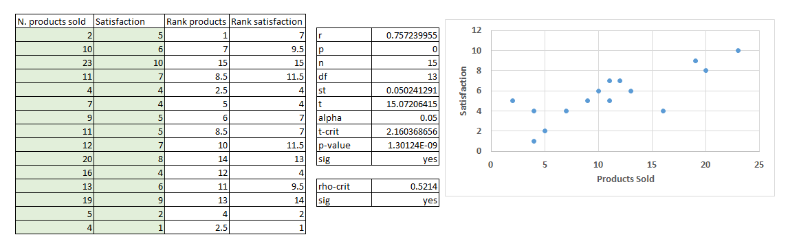
If the number of observations is larger than 10, we can use the p-value to verify whether the correlation coefficient is significant or not. If it is smaller than 10, we should use a table with critical values (see the template), and, in the case that the absolute value of the correlation coefficient (r) is larger than the critical value (rho-crit), then it is significant.
50. PHI CORRELATION
OBJECTIVE
Identify the association or correlation between two nominal variables.
DESCRIPTION
When we have categorical dependent variables, this method is used as the counterpart of the Pearson correlation with numeric variables or the Spearman correlation with rank variables. It can also be defined as the measure of the effect size of a chi-square test (which is used when we have categorical dependent and independent variables). The first step is to create a contingency table, that is, a double-entry table with the cross-frequencies of the selected variables. In our example we want to check the association between a specific therapy and the end of an illness in several patients. The dependent variable is represented in the rows (cured and not cured) and the independent variable in the columns (therapy 1 and therapy 2).
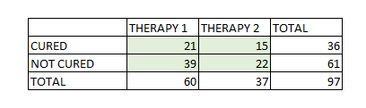
Then we have to run a chi-square test comparing the observed frequencies with the expected frequencies (for the expected frequencies we create a copy of the table and calculate them in the same way as for the chi-square test; see 48. CHI-SQUARE ). With this value we can calculate two coefficients of correlation:
-
Phi coefficient: this is the simplest coefficient used as a measure of the association of two categories in two variables;
-
Cramer’s V coefficient: this is an adjusted phi coefficient and the two variables can have more than two categories; it can also compare a categorical variable with an ordinal one.
Figure 58 presents some guidelines that will help to interpret the results of the two tests: in other words the degree of association between the two variables (small, medium, or large). The interpretation of the Cramer’s V coefficient will depend on the number of categories being compared; in the case of having just two, the results and interpretation will be the same as the phi correlation coefficient.
51. MANN–WHITNEY U TEST
OBJECTIVE
Verify whether the difference in two groups is significantly different (in the case that the assumptions for parametric tests are not met).
DESCRIPTION
It defines whether two samples are significantly different, and it is used instead of the two-sample t-test when normality assumptions are not met, data are ordinal, or there are significant outliers.
This test requires some assumptions: the data are at least ordinal, the sum of observations in the two samples is at least 20, the observations are independent (we can use this test as a substitute for the t-test of independent samples but not a paired t-test), and the two samples have similar distribution shapes.
For the test we need to combine all the data and rank each value (in the case of tied values, an average ranking is calculated as in Spearman’s test).
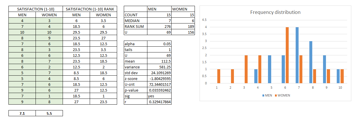
In the example a one-tailed test is performed to verify whether men on average are more satisfied than women. Since the p-value is smaller than the alpha (0.05), we reject the null hypothesis and can assume that men are more satisfied than women.
52. WILCOXON SIGNED-RANK TEST
OBJECTIVE
Verify whether the difference in two groups is significantly different (in the case that the assumptions for parametric tests are not met).
DESCRIPTION
It is a non-parametric substitute of the t-test in the case that normality cannot be verified or the sample is too small (smaller than 30), but, differing from the Mann–Whitney test, it is used for paired samples (the groups are not independent). The example presented here is a “signed-rank Wilcoxon test” (for paired samples and as a counterpart of the parametric paired t-test).
The assumptions for this test are: the samples are from the same population, the pairs are chosen independently, the data are measured at least on an ordinal scale (continuous, discrete, or ordinal), and the distribution is not especially skewed (that is to say it is approximately symmetrical).
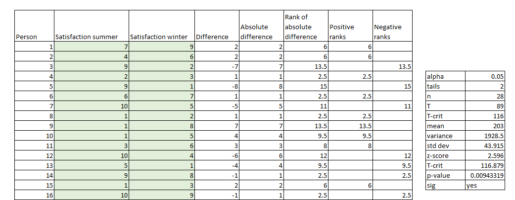
To perform the test, the difference between observations is calculated and ranked. When we have samples with fewer than 25 observations, we use a table with a t-critical value to verify the significance; specifically, we reject the null hypothesis (there is no difference in the samples) if T is lower than T-critical. If we have a larger sample, we can use the p-value for the assessment of the significance.
53. KRUSKAL–WALLIS TEST
OBJECTIVE
Verify whether two or more groups are significantly different (in the case that the assumptions for parametric tests are not met).
DESCRIPTION
This test is an extension of the Wilcoxon signed-rank test to more than two independent samples. It can also be seen as the non-parametric counterpart of the one-way ANOVA, used when the samples do not have a normal distribution (above all when the sample is small) or when the variances are very different. However, this test requires the samples to have similar distribution shapes (which can be assessed using a histogram), to be of similar size, and to have more than five observations.
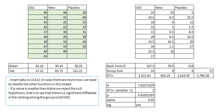
The example presented in the template concerns the launching of a new pill. In the experiment the respondents are given one of the three pills (old, new, and placebo), and they have to report the number of days for which the effect of the pills remained. The results are ranked, and the test is performed. If the p-value is lower than the alpha (0.05), we reject the null hypothesis and can say that there is a significant difference among the three groups; to put it another way, the pills have different effects. In the case of significance, we can perform a pairwise comparison using the Mann–Whitney U test.
54. FRIEDMAN TEST
OBJECTIVE
Verify whether two or more groups are significantly different (in the case that the assumptions for parametric tests are not met).
DESCRIPTION
This test is the non-parametric counterpart to the one-way ANOVA with repeated measures.
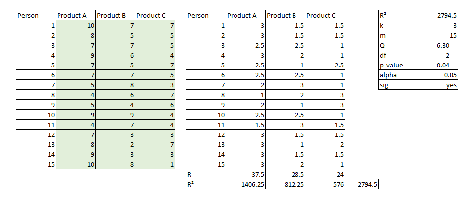
The example in the template concerns an experiment in which we ask fifteen potential customers to try three versions of a product and to give an evaluation from 1 to 10. The results for each person are then ranked and the test is performed. If the p-value is smaller than the alpha (0.05), we reject the null hypothesis and infer that there is a significant difference in the preference of at least two out of the three products.
55. SCHEIRER–RAY–HARE TEST
OBJECTIVE
Verify whether two or more groups are significantly different (in the case that the assumptions for parametric tests are not met).
DESCRIPTION
This test is the non-parametric counterpart of the two-way ANOVA with repeated measures or, if we compare it with other non-parametric tests, it is the two-factor version of the Kruskal–Wallis test. The same conditions as the Kruskal–Wallis test have to be met; in particular, the samples must have the same size and at least five observations each.
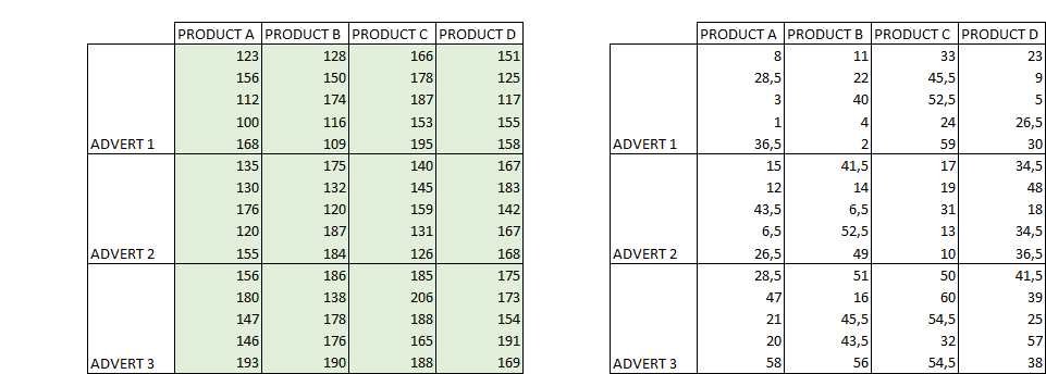
In the template example, we have three types of advertisement (rows) and three different products (columns). For each intersection we register the number of products sold. The data are registered five times for each intersection advertisement/product. The data are then ranked, the ANOVA test is performed on the ranked data, and the H values are calculated using the output of the ANOVA test.
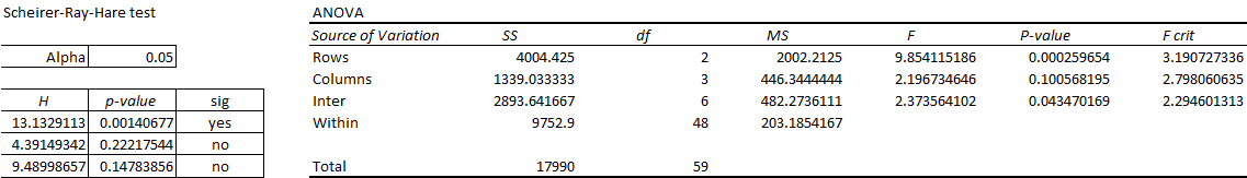
In the example only the “rows” parameter is significant, meaning that the type of advertisement affects the number of products sold. However, the kind of product is not a determinant variable.
56. MCNEMAR TEST
OBJECTIVE
Verify whether there is a significant change before and after an event (nominal variables).
DESCRIPTION
This non-parametric test is the counterpart of the parametric paired t-test or the non-parametric Wilcoxon signed-rank test when the repeated measures are dichotomous (yes/no, 1/0, cured/not cured, etc.). In the example a company decides to launch a specific campaign to increase the recommendation of its products. After the campaign the number of customers who changed from detractors to advocates is recorded as well as the number of customers who changed in the opposite direction.
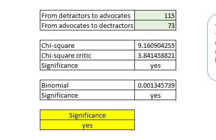
As a rule of thumb, when the sum of the two subjects that changed group (in our example the number of customers who changed their recommendation attitude) is lower than 25, we should use a binomial distribution or a chi-square distribution. In the template a formula calculates this condition automatically, and, if the highlighted cell reports that the test is significant, then we reject the null hypothesis and infer that there is a significant difference in the change of attitude. To put it another way, we can say that the campaign increased the recommendation of customers.
57. COCHRAN’S Q TEST
OBJECTIVE
Verify whether there is a significant change before and after an event (nominal variables) when we have more than two groups.
DESCRIPTION
The Cochran’s Q test is the counterpart of the parametric ANOVA with repeated measures and the non-parametric Scheirer–Ray–Hare test when the repeated measures are dichotomous. The template shows the example of a company that wants to discover whether the satisfaction of clients differs significantly according to the season. The dichotomous measure is satisfaction (1 = satisfied, 0 = not satisfied), and for a sample of twenty customers we have their responses in three seasons: high, intermediate, and low.
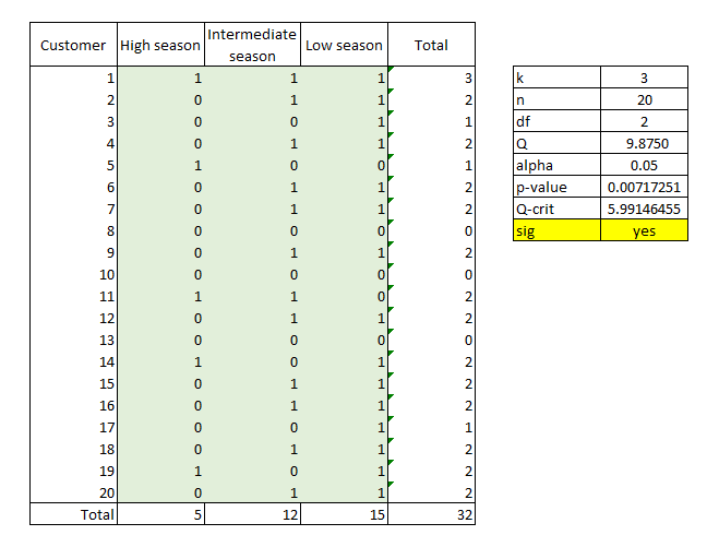
After running the test, if the p-value is lower than 0.05, we reject the null hypothesis and therefore there is a significant difference in satisfaction depending on the season. Once we have rejected the null hypothesis, we should run a pairwise Cochran’s Q test (simply by repeating the test and using the two seasons each time) or we can perform a McNemar test.
58. INTRODUCTION TO CLASSIFICATION MODELS
In the following chapters, I group several methods of which the purpose is to classify either variables or elements of data sets.
The first two methods, binary classification and logistic regression, define an element’s membership of one of the two outcome groups based on one or more input variables. Cluster analysis is an exploratory technique that classifies elements into groups by similarities in several input variables. Profile analysis is performed to analyze the similarities and dissimilarities of different groups to define the profiles. Principal component analysis and exploratory factor analysis are used to group different variables into latent variables, while confirmatory factor analysis first defines the latent variables in a model and then validates the model.
59. BINARY CLASSIFICATION
OBJECTIVE
Classify the elements of a data set into two groups.
DESCRIPTION
In binary classification the goal is to classify the elements of a data set into two groups according to a more or less complex classification rule. The example proposed in the template concerns a company that wants to promote a very exclusive perfume by giving a free sample to some of its customers. The cost of providing a free sample is €50, but in the case of reaching the right customer, the expected return is worth €950 (€1000 minus the cost of the sample). To classify the clients, the company decides to use a score that is calculated from the number of purchases and the average amount spent by each customer (see 33. SCORING MODELS for more information about the creation of score indicators). Our classification rule is “the higher the score, the more likely it is that the free sample will work.”
The first step is to check whether the chosen classification rule is valid, that is to say how efficiently it allows us to classify the elements (customers). The ROC curve measures the efficiency of the classification, and it is the combination of:
-
Sensitivity: TRUE POSITIVE RATIO = TP / (TP+FN)[^27]
-
1-specificity: FALSE POSITIVE RATIO = 1 - TN / (TN + FP)
The curve is obtained by ordering our sample of 20 clients from the highest to the lowest score and reporting the results of the experiment (1 = the client bought the product, 0 = the client did not buy the product; see Figure 67 ).
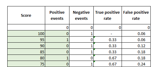
The ROC curve is the continuous line in the following graph (Figure 68 ), while the dashed line is the theoretical ROC curve in a model in which the classification is random. Graphically, we understand that our model is more efficient than a random classification method, since the continuous line is above the dashed line. The area under the curve (AUC) is the measure of classification efficiency and represents the probability of a positive event being classified as positive. A random model (red line) has an AUC of 0.5, while a good model has an AUC higher than 0.7. Our model has an AUC of approximately 0.82, so we can conclude that our classification rule classifies customers efficiently.
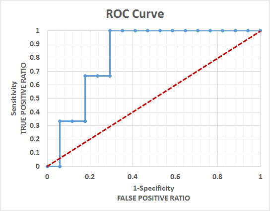
The next step is to find the optimal threshold, which is the minimum score that a client should have to receive a free sample. For that we have to assign the costs and gains of the four possible results of the classification:
-
True positive: if we give a free sample to the right customer, we have a cost of €50 for the sample and a return of €1000, so we assign to the TP a revenue of €950;
-
False positive: if we give the sample to the wrong customer, we have a cost of €50;
-
True negative: we correctly establish that this customer will not buy in spite of the free sample, so we have neither costs nor revenues;
-
False negative: we fail to identify a customer who would have bought the product, but still we have neither costs nor revenues.
When we define this matrix, we do not have to include either opportunity costs (the potential revenues lost in a false negative) or opportunity gains (the money saved from not sending a free sample to the wrong customer in a true negative). If we included them, we would double the costs and revenues. In our example the optimal threshold is a score of 65, which means that the company has to send a free sample to customers with at least this score.
This cost/revenue matrix can be used to establish the probability threshold in a logistic regression (see 60. LOGISTIC REGRESSION ). Using the same example, we can perform a logistic regression with several predictor variables (number of purchases, amount spent, location, marital status, etc.) and calculate the probability of individual customers buying a product. On the basis of the cost of incentives and the gains from reaching the right customers, the probability threshold may be higher or lower than 0.5.
60. LOGISTIC REGRESSION
OBJECTIVE
Predict a binary outcome from one or more quantitative predictor variables.
DESCRIPTION
This regression is used to answer yes/no questions, such as to buy or not to buy a product based on one or more predictor variables, meaning that it calculates the probability of the event occurring (buying the product). When we have a binary outcome, we cannot perform a linear regression, since the assumptions of normality of distribution and equal variance are not met for the target variable. If the variables are categorical, we need to transform them into dummy variables (see 38. LINEAR REGRESSION ).
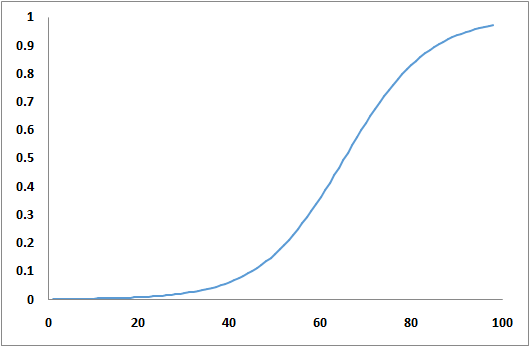
In the template I use the log-likelihood function and the Excel complement “Solver” to estimate the regression parameters. Once we have obtained the results of the regression, we have to apply an exponential function to obtain the odds of an event, since we cannot use the parameters directly.
The proposed template includes a logistic regression with one predictor variable, but more variables can be added. In addition, we can use a target variable with more than two values and perform a multinomial logistic regression.
61. CLUSTER ANALYSIS
OBJECTIVE
Identify groups of customers or products (or other objects).
DESCRIPTION
Cluster analysis is an exploratory technique that groups a series of objects into homogeneous clusters using one or more input variables. The goal is to find the right balance between the similarity of the objects within each cluster and the dissimilarity among clusters. The ability to identify groups of customers or products can be used to leverage synergies or to allocate resources better.
The simplest clustering technique is the one that uses a two-variable matrix and visually identifies possible groups. The example shown in the template concerns a stock problem. Suppose that a company wants to optimize the stock of different products, knowing that having a large stock of each product is very expensive but that running out of products when requested implies economic and image damage. To solve this problem, the company needs to decide which products will have a large stock and which will be more “on demand.” The variables used are the average daily sales volume and volatility of sales (the standard deviation of daily sales divided by the daily average sales of each product).
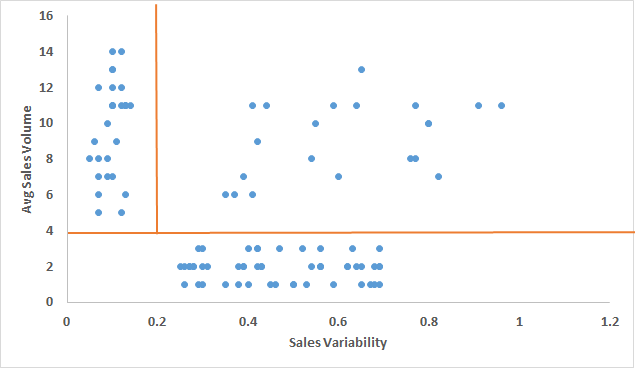
We can identify three main groups of products:
-
In the top-left corner, we have products with strong sales and low variability for which the company will maintain a large stock;
-
In the top-right corner, we have products with strong sales but with high variability and therefore the company will decide on a case-to-case basis;
-
The third group (lower part) has a low volume of sales and a high level of variability and the company will produce these items on demand.
This is a simple and visually effective technique; however, if we want to define the clusters with a more robust technique or to include more than two variables, we should use statistical software. Several methods can be used (hierarchical models, k-means, distribution-based, density-based, etc.), but they usually follow the same steps:
-
Choose the variables: include relevant explanatory variables (for example for a product we can choose the average volume of sales, the average price, etc.) and exclude variables that are exogenous or merely descriptive (color, size, etc.);
-
Identify and eventually eliminate outliers;
-
Define the number of groups: the number of groups can be decided using statistical methods (dendrograms) or business criteria (common sense, constraints of the organization, etc.); we can also start with a larger number of groups and then reduce it until we find the optimal number;
-
Normalize the variables: variables can be on different scales, so we have to normalize them to obtain comparable distances;
-
Choose the clustering method depending on the business issue, the variables used (quantitative or qualitative), and whether the number of groups is known;
-
Run the test and analyze the results; we can also use ANOVA;
-
Use explanatory and descriptive variables to describe the groups.
62. PROFILE ANALYSIS
OBJECTIVE
Identify whether two or more groups have significantly different profiles.
DESCRIPTION
This analysis is performed when the aim is to compare the same dependent variables between groups over several periods or when there are several measures of the same dependent variable. It is usually performed to analyze the results of different kinds of tests (psychological, intelligence, etc.).
To compare data between groups, profile analysis uses both graphical representations (plots) and statistical methods that analyze the variance. The plots are usually represented with scores or responses on the y axis and time points (or observations or tests) on the x axis. These representations provide an idea of the similarity/dissimilarity of the groups. However, using statistical methods (ANOVA, MANOVA, etc.) we can answer statistically the three main questions in a profile analysis:
- Do the groups on average have equal levels of scores across time points or observations?
- Are the groups’ performances parallel across time points or observations?
- Do the profiles present flatness across time points or observations? (Flatness is when the score across different points does not change significantly and the line is approximately flat.)
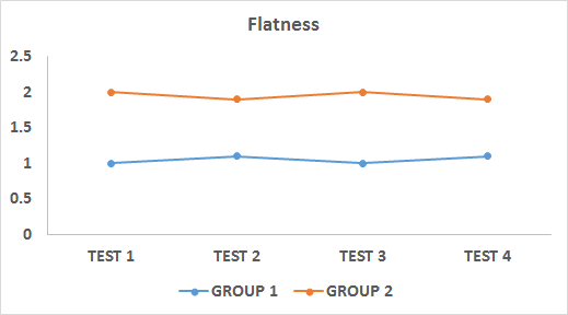
The proposed template only offers a graphical representation of equal levels, parallelism, and flatness. For a proper profile analysis we should use a statistical tool. The data for a profile analysis usually come from several kinds of tests (psychological, intelligence, etc.) or from experiments (the taste of food to potential customers, response to a cure, etc.).
63. PRINCIPAL COMPONENT ANALYSIS
OBJECTIVE
Analyze the interrelations among several variables and explain them with a reduced number of variables.
DESCRIPTION
A principal component analysis (PCA) analyzes the interrelations among a large number of variables to find a small number of variables (components) that explain the variance of the original variables. This method is usually performed as the first step in a series of analyses; for example, it can be used when there are too many predictor variables compared with the number of observations or to avoid multicollinearity.
Suppose that a company is obtaining responses about many characteristics of a product, say a new shampoo: color, smell, cleanliness, and shine. After a PCA it finds out that the four original variables can be reduced to two components[^28]:
-
Component “quality”: color and smell;
-
Component “effect on hair”: cleanliness and shine.
Even though it is possible to run a PCA in Excel with complex calculations or special complements,[^29] I suggest using a proper statistical tool. Here I will only explain some guidelines when performing a PCA.
First of all, the analysis starts with a covariance or correlation matrix. I suggest using a correlation matrix, since we cannot use a covariance matrix if the variables have different scales or the variances are too different. Then, eigenvectors (the direction of the variance) and eigenvalues (the degree of variance in a certain direction) are calculated. Now we have a number of components that is equal to the number of variables, each one with a specific eigenvalue.
The more variance (eigenvalue) that a component explains, the more important it is. There are several approaches that we can use to choose the number of components to retain:
-
Defining a threshold before the analysis:
-
choose all the components with a certain eigenvalue (usually > 1);
-
choose a priori a specific number of components (then verify the total variance explained and other validity tests);
-
choose the first x components that explain at least X% of the variance, for example 80% if using the results for descriptive purposes or higher if the results will be used in other statistical analysis (Figure 74 );
-
-
Use a scree plot (Figure 75 ) and “cut” the line at the main inflexion point or at one of the main inflexion points where there is an acceptable total variance explained (for example, in Figure 75 the first four components can be chosen, since there is an important inflexion point, but they just explain 60% of the variance).
The next step is to analyze the principal components’ correlation coefficients in a matrix with variables and components. Ideally we want one variable to have a high correlation with one component to define each component conceptually (smell and color = component “quality”). However, even if we cannot explain the resulting components conceptually, we have to bear in mind that the main objective of a PCA is to reduce a large number of variables to a manageable number of components, while interpreting the component is not strictly necessary. In chapter 64. EXPLORATORY FACTOR ANALYSIS , PCA analysis will be used as the method for a factor analysis, and I will introduce optimization methods, factor scoring, and validity tests.
64. EXPLORATORY FACTOR ANALYSIS
OBJECTIVE
Explore the underlying latent structure of the data to identify implicit unobserved variables that are “hidden” behind several observed variables.
DESCRIPTION
An exploratory factor analysis (EFA) analyzes the interrelation among a large number of variables to find a small number of latent or implicit variables (called factors) that explain most of the correlation/covariance of the original variables. There is usually confusion between PCA (principal component analysis) and EFA. The main goal of PCA is to reduce a large set of variables to a smaller possible set of variables that still explain most of the variance.
Unlikely PCA, EFA is used to identify or understand complex concepts that are not directly measurable: social status, intelligence, psychological profile, sociability, and so on. For example, in an EFA we can see that there are similar patterns in responses about income, education, and occupation, so we can identify them as the latent variable “social status.”
Before starting the analysis, we should check some assumptions:
-
Normality: it is not a compulsory requisite but it can improve the results;
-
Sample size: ideally we should have a large ratio between the number of observations and the number of variables, for example 20:1 (we can still accept lower ratios, but those under 5:1 are not recommended).
As in the PCA analysis, I will not propose an Excel template, since I highly recommend performing EFA with a proper statistical tool. However, if we are really interested in running EFA in Excel, tutorials are available online.[^30] In general, a smaller sample size will require higher correlations for the analysis to produce valid results (validity tests are explained later in this chapter).
We start by choosing the method for extracting the factors, which is PCA in our case, but there are some other methods (principal axis, maximum likelihood, etc.). Therefore, the first steps are the same as those for PCA (see 63. PRINCIPAL COMPONENT ANALYSIS ):
-
Reproduce a correlation matrix;
-
Choose the threshold for the number of retained factors (eigenvalue, number of factors, total variance explained, scree plot).
Statistical tools also offer a choice of rotation method. Without entering into the technical explanation, I think it is enough to know that it maximizes the differences between the loading factors to have ideally one variable with high correlation with one factor. The most popular and most-used method is probably varimax, but the advantages and disadvantages of the other methods can be investigated.
At this point we will have a correlation matrix, a scree plot, and a table summarizing the components together with their eigenvalues and the percentage of variance explained. The next table to be used is a matrix with factors and variables filled with loading factors. Loading factors are measures that range from -1 to 1 and represent how much a factor explains a specific variable. This is the key to understanding the underlying data and interpreting a factor conceptually. In Figure 76 it is clear that Factor 1 explain mainly variables 5, 6, 7, 8, and 10, while Factor 2 explains variables 1 to 4. Variable 9 has low loading factors with both factors, so it may be excluded. In addition, as a rule of thumb, each variable should have a communality of at least 0.5 to be maintained in the model. The communality of a variable is the proportion of variation explained by the retained factors.
Having chosen the retained factors and variables, we have to recalculate the loading factors and communalities. Afterwards, we need to perform a validity test to check for two possible problems: 1) the correlation among the variables is too low and 2) the correlation among the variables is too high and there is a risk of multicollinearity.
For the first problem we should run two MSA (measure of sample adequacy) tests:
-
Bartlett’s test: if the p-value is significant (usually < 0.05), the overall correlation among the variables is acceptable;
-
KMO test: this is a measure from 0 to 1 that verifies whether there is a variable that does not correlate well (it should be higher than 0.5[^31]; otherwise, we should check the “anti-image correlation matrix,” which provides single KMO values of each variable, and identify the one that may have to be removed).
To discard the hypothesis of multicollinearity, we should first become suspicious at the beginning of the test if in the correlation matrix there are values close to 0.9 or higher. Then, we can look at the “determinant” of the correlation matrix, which should be near 1, while a near 0 determinant would signify probable multicollinearity. We can also run a Haitovsky’s significance test (check the p-value, which should be < 0.05).
[
]{.mark}
65. CONFIRMATORY FACTOR ANALYSIS
OBJECTIVE
Confirm or reject a structured equation model that identifies one or more latent (not observed) variable.
DESCRIPTION
Confirmatory factor analysis (CFA) uses almost the same statistical techniques as exploratory factor analysis (EFA) but is conceptually quite different. While EFA explores measured variables to discover possible latent unobserved variables (factors), CFA firstly defines a theoretical model and then runs a factor analysis either to confirm or to reject the proposed model.
The model definition implies specifying the number of factors, the variables that relate to each factor, and the strengths of the relationships. The model is usually represented by a path diagram similar to the one described for path analysis (see 40. PATH ANALYSIS ).
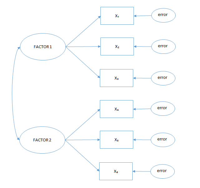
For example, we hypothesize that there are two latent variables, “social status” and “influence on other people.” We then design the theoretical model by defining:
-
Latent variables (factors): social status and influence (represented by ellipses);
-
Observed variables (e.g. income and education) represented by rectangles;
-
Relations between variables and factors (factor loadings) that are represented by simple arrows (variables can be related to just one factor or to both of them);
-
Correlation between factors, if we think it exists (curved double-headed arrows);
-
Errors, represented by ellipses (usually we have errors pointing at all the observed variables);
-
Correlation between errors, if we think it exists (curved double-headed arrows).
An important limitation is that the number of free parameters (relations established in the path diagram) has to be lower than the number of distinct values. Distinct values are calculated by the formula p * (p + 1) / 2, where p is the number of variables. The number of free parameters is the sum of all the relations established in the model (to put it simply, the number of arrows in the path diagram).
The model can be tested using for example the chi-square test for the “badness of fit” (see 48. CHI-SQUARE ) or by other methods (RMSEA or GFI). The recommended values for the model to have a good fit are:
-
Chi-square p-value > 0.05;
-
RMSEA < 0.05;
-
GFI > 0.95.
This Excel template can help in calculating the goodness of fit of SEM models: http://www.watoowatoo.net/sem/sem.html . If the model fitting is not satisfactory, the path diagram needs to be modified to seek a better fit by:
-
Eliminating non-significant parameters by checking the t-statistics of the parameters (i.e. if they are larger than 1.96);
-
Adding new parameters using two techniques:
-
Modification index: a large value indicates potentially useful parameters;
-
Expected parameter change: the approximate value of the new parameter if added;
-
-
Analyzing the standardized residual matrix and checking for values higher than 1.96 or 2.58 (for example), which identify values that are not well accounted for in the model.
66. Forecasting overview
The objective of forecasting is to produce predictions and indications (usually demand or sales) for future periods using historical data and making several assumptions. For example, we want to forecast the monthly sales of the year +1 and we take as a reference the monthly sales of the current year. An assumption could be that the sales will not change next year and our forecast will be equal to the historical data. Other simple-to-implement assumptions can be to establish a fixed increase in sales each month or a proportional increase, for example 10%. Assumptions can become much more complex when using trend or causal models.
To carry out robust forecasts, it is important to identify the elements that have an impact on the demand and use the best technique available to estimate the impact. The answers will not be found for all the elements that have an impact on the demand, but it is necessary to make the best assumptions by complementing quantitative techniques with qualitative techniques and personal business insights.
A regression can be used to define price elasticity and, knowing that the company will change its prices, this parameter can be included in the forecast. However, if we just use historical data and apply the price elasticity effect to a price shift, we are assuming that the other elements affecting the demand do not change: the demand is stable, customers do not change their behavior or taste, competitors maintain their actual prices, and so on.
FORECASTING TECHNIQUES AND METHODS
There are several methods[^32] available, and choosing among them depends on five main factors:
-
The life cycle phase of our product or service (the emergent, growth, or mature phase);
-
The type of product;
-
The minimum accuracy required and how much we are willing to invest in time and money;
-
The data availability (and the cost of obtaining more data if possible);
-
The scope of the forecast (short, medium, or long term).
We can group the forecasting models into three categories:
-
Qualitative techniques: the forecast is based on the opinion of experts (the Delphi method, brainstorming, panel consensus, etc.), the opinion of customers through surveys, or market research. It is usually applied when we do not have quantitative data (a product launch) or for forecasts of several years ahead.
-
Time series and projections: the forecast is based on pattern recognition about past data (seasonality, cycles, and trends) and the projection of these patterns into the future. Its accuracy is greater when the product has already entered into a steady phase (the mature phase). These methods can be more stable or more sensitive to changes; however, they cannot predict turning points based on special events and can only react more or less rapidly to a change in measured data. Examples are the moving average, exponential smoothing, and time series analysis.
-
Causal models: the forecast is based on the relationship between the outcome (sales) and one or more predictor variables, such as product characteristics (price, quality, and availability), competitors’ product characteristics, our strategy vs competitors’ strategy (advertising, promotions, etc.), or external factors (economic or geopolitical factors). This group includes different kinds of regressions, pricing models, and customer analytics models for predicting future behavior.
In the following chapters I will start by explaining how to perform an S-curve life cycle analysis, which is considered to be a causal model but is in part also a projection model. I think that this method should not be used alone but as the base for more accurate forecasting methods. Then I will focus on the three most-used “time series and projection” methods: moving average, exponential smoothing, and time series analysis. Finally, I will include two causal methods used in revenue management (pickup models and regressions). I will not include pricing models and customer analytics models, since they have already been included in previous chapters.
FORECAST PERFORMANCE
To choose the best method to use, first of all we should consider the kind of business and the available data. However, this information is usually not sufficient and we need to compare different methods based on their performance.
The performance is calculated by the forecast error, that is to say the difference between the real data and the forecasted data. If we have enough data, it is a good practice to use part of it to build the model (training data) and part of it to test the model (test data).
Two of the commonly used error methods are:
-
MSE (mean squared error): this is the average of the squared errors of each period;
-
MAPE (mean absolute percentage error): this is the average of the absolute percentage error of each period.
67. S-CURVE LIFE CYCLE ANALYSIS
OBJECTIVE
Identify the maturity of a product or service and forecast the demand for the next periods.
DESCRIPTION
The assumption behind this model is that usually a product has a life cycle that follows an S-shaped curve with three main phases (see 12. PRODUCT LIFE CYCLE ):
-
Emergent phase: this is characterized by a low number of firms, low revenues, and usually zero or negative margins;
-
Growth phase: the margins are increasing rapidly (for a while, but less in the last part of the growth phase), as well as the number of firms;
-
Mature phase: the global revenues are increasing at a far lower rate; both the margins and the number of firms are decreasing. At this point the product can enter into a decline phase, for example if a newer substitute product is introduced or if the demand is decreasing.
As mentioned in chapter 12. PRODUCT LIFE CYCLE , it is important to identify the phase of the product or service (this analysis also applies to different product levels – brand, product line, product category, etc.). For this purpose we should identify the trend in the number of firms, revenues, and margins. However, we can complement this analysis with a statistical approach that will help us to forecast the future growth.
If our product is in the emergent phase or just in the development phase, we do not have enough data to estimate the S-curve, so we should use the data of products with similar characteristics and analyze their product life cycle curves. It is important to make good assumptions about the market saturation level and the differences between our product and the similar product that can affect the growth rates in the three phases. The more data we obtain after the launch of our product, the more precisely we can compare it with the S-curve of similar products and, thus, the more we can adjust our assumptions.
If we estimate that our product is already in the growth phase, besides comparing it with similar products, we can build our S-curve using for example a logarithmic linear estimate (see the template) and forecast future sales. As shown in Figure 78 , the sales data for each period (years[^33]) are inserted into the table then transformed to estimate a linear trend. In the last row of the table, the logarithmic transformation is reversed and the sales are projected (see the graph on the right in Figure 79 ).
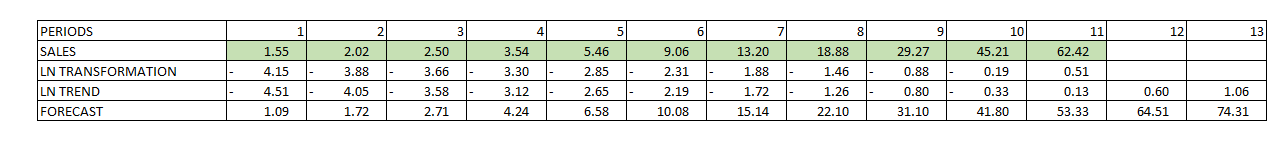
If we think that the S-curve does not fit the forecast properly, we can change our assumptions about the market saturation level (which will change the log-transformed data and thus our forecast). In the template the R^2^ is calculated and we can use it as a measure of how well the forecast curve fits the actual sales data. However, remember that our assumptions about market saturation levels are more important than reaching a “perfect” fit of the forecast curve. For example, we can reach a higher R^2^ but with an improbably high market saturation level. In fact, there are different factors that can affect the shape of the curve: the economic situation, competitors’ strategies, the entry of new substitute products, new fashions, and so on.
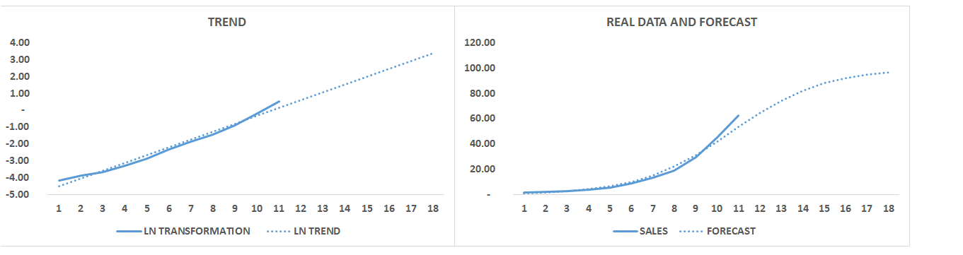
Finally, in the case that our product is already in the mature phase, this model will just project a slightly increasing or stable level of sales. However, it cannot predict or estimate whether or when our product will pass into the decline phase. This can be realized only when the product has already started to decline. Anyway, when it becomes apparent that our product is in the mature phase, our strategic actions will focus on optimization and “life extension.” On one side we have to optimize what we can obtain with this product and its market by reaching its full potential (pricing optimization, loyalty programs, product bundling, advertising, promotions, etc.). However, sometimes this is not enough either to continue to increase sales or to avoid declining. In this case we should consider actions that are able to “push upward” the S-curve, extending the life cycle of the product: product evolution, innovation, new markets, new use of the product, and so on.
Finally, it is important to remember that this is not a precise forecasting method, since this is not its main goal. With this method we can project the medium- and long-term product growth potential, but, for a more accurate forecast, this method has to be complemented with more precise methods, especially for the short-term forecast.
68. MOVING AVERAGE
OBJECTIVE
Forecast the demand for the next periods.
DESCRIPTION
The assumption behind this model is that the recent demand is a good predictor of the future demand. The formula is:
Moving average: Ft+1 = (1/n) times the sum of X from period t−n+1 through t.
The demand forecast (F) for the next period (t + 1) is forecast by averaging the demand (X) of a number of periods (n) including the present one (t). Here the election of the number of periods is fundamental. The more periods that we include in the average, the more we reduce the randomness in the model, but, on the other side, we lose important information about seasonality. A variation of this model is a weighted moving average model in which different periods have different impacts on the moving average. Usually more weight is given to more recent periods, but a different approach can be chosen depending on the kind of business.
The moving average does not perform well in the presence of seasonality or business cycles, because it smooths the time series being used. However, it is a valuable method for extracting seasonality, cycles, or irregularity from a time series to carry out more advanced forecasting methods, such as regressions or ARIMA (see 70. TIME SERIES ANALYSIS ).
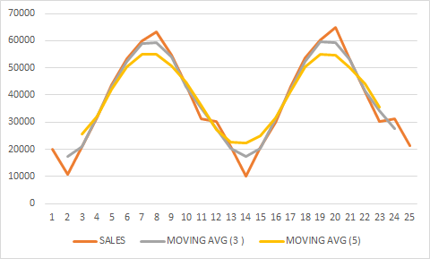
69. EXPONENTIAL SMOOTHING
OBJECTIVE
Forecast the demand for the next periods.
DESCRIPTION
Unlike the moving average, exponential smoothing includes all the time series data in the forecast and places more weight on the most recent values, diminishing the weight of old data exponentially over time.
Ft+1 = aXt + (1 − a) Ft
The forecast for the next period (Ft+1) is calculated by a weighted average of the value of the current period (Xt) and the forecast of the current period (Ft). The weight of the current period value (a) is arbitrary, and the goodness of the forecast should be tested using different weights. A lower a (close to 0) means that more weight is put on earlier observations, giving a smoother curve (this is usually appropriate when the time series are stable). An a closer to 1 puts more weight on more recent observations and responds faster to changes in the time series. Since we have no data for the first period forecast, we can use the real data of the period.
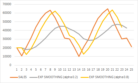
Like the moving average, single exponential smoothing is not suited to time series with a significant trend or seasonality; however, we can include the trend and seasonality components in the formula:
St = y(Xt − Ft) + (1 − y) St−s
Tt = β(Ft − Ft−1) + (1 − β) Tt−1
Ft+1 = aXt + (1 − a) Ft + Tt + St
where S is seasonality, y is the seasonality weight, T is the trend, and β is the trend weight. The greater the weight, the more responsive to changes is the forecast. The smaller the weight, the more stable is the forecast.
70. TIME SERIES ANALYSIS
OBJECTIVE
Forecast the demand for the next periods.
DESCRIPTION
Time series analysis is useful for forecasting based on the patterns underlying the past data. There are four main components:
-
Trend: a long-term movement concerning time series that can be upward, downward, or stationary (an example can be the upward trend in population growth);
-
Cyclical: a pattern that is usually observed over two or more years, and it is caused by circumstances that repeat in cycles (for example economic cycles, which present four phases: prosperity, decline, depression, and recovery);
-
Seasonal: variations within a year that usually depend on the weather, customers’ habits, and so on;
-
Irregular components: random events with unpredictable influences on the time series.
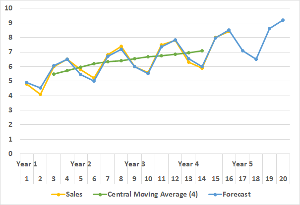
There are two main types of models depending on how the previous four components are included:
(1) Y(t)=T(t) x S(t) x C(t) x I(t)
Multiplicative models: the four components are multiplied, and in this case we assume that the components can affect each other.
(2) Y(t)=T(t) + S(t) + C(t) + I(t)
Additive models: we make the assumption that the components are independent.
Another important element of time series is stationarity. A process is stationary when an event is influenced by a previous event or events. For example, if today the temperature is quite high, it is more likely that tomorrow it will be quite high as well.
There are many models for time series analysis, but one of the most used is ARIMA (autoregressive integrated moving average). There are some variations of it as well as non-linear models. However, linear models such as ARIMA are widely used due to their simplicity of implementation and understanding.
A good time series analysis implies several exploratory analyses and model validation, which requires statistical knowledge and experience. The template contains a simplification of a time series model in which seasonality and trends are isolated to forecast future sales.
The data can be collected at every instance of time (continuous time series), for example temperature reading, or at discrete points of time (discrete time series), when they are observed daily, weekly, monthly, and so on.
71. PICKUP MODELS
OBJECTIVE
Forecast the demand for the next periods.
DESCRIPTION
Pickup models are advanced forecasting models used in revenue management, and they can be applied in businesses that book the service in advance (airlines, hotels, theaters, etc.). The forecast is calculated using the current bookings for a certain future period and estimating the incremental bookings (pickup) from now until this future period (i.e. departure date, check-in date, etc.).
The pickup is calculated using past data, and it can be the average pickup with a specific anticipation (x days before) if we are summing it with the current bookings or it can be an average pickup ratio (total bookings / bookings x days before) if we are multiplying it by the current bookings:
BDB0 = BDBX + mean(PU)DB(X,0)
BDB0 = BDBX × mean(PUR)DB(X,0)
In the first formula (additive pickup), the bookings on anticipation day 0 (BDB0) are equal to the current bookings (BDBX) plus the average pickup bookings between anticipation day x and anticipation day 0 (PUDB(X,O)). In the second formula (multiplicative pickup), the forecast is calculated by multiplying the current bookings by the average pickup ratio (PURDB(X,0)).
To estimate good forecasts, it is very important to calculate carefully either the average pickup or the pickup ratio. Take as an example an airline company. If we are using the average pickup, then we should take into consideration seasonality at different levels: time of the day, day of the week, month, holidays, and so on. The amount of incremental bookings depends heavily on the demand for a specific departure time, so we should calculate the average using similar days. However, if we are using the average pickup ratio, we do not have this problem but may discover that the booking pace is different for different departure periods; for example, more people are anticipated to book during summer periods. In this case it is important to calculate the average pickup ratio from similar departure periods.
We can also take a step further and expect that the booking pace may change over time, either because the customer behavior has changed or because we have widened the booking horizon. For example, we can calculate a trend in the pickup ratio and adjust it for the prediction of future periods.
72. REGRESSIONS
OBJECTIVE
Forecast the demand for the next periods.
DESCRIPTION
This method is similar to the pickup model since it predicts final bookings based on the number of bookings in a certain anticipation period:
BDB0 = β0 + β1BDBX
The bookings on anticipation day 0 (BDB0) are the dependent variable, the current bookings (BDBX) are the independent variable, β0 is the intercept, and β1 is the X regression parameter.
The technique used to define the relation between current bookings and final bookings is a linear regression, but it is also possible to use other types of regressions (for more information see36. INTRODUCTION TO REGRESSIONS ).
72 REGRESSION (BOOKINGS FORECAST)
What-if analysis and optimization models
73. What-if analysis and optimization overview
What-if analysis includes a broad range of techniques used to depict future possible scenarios based on the possible developments or turning points that can affect them. For example, we can hypothesize different scenarios with different states of the economy or with different competitors’ strategies.
Even though with this analysis we can estimate the most probable outcome (i.e. the most likely scenario or the average of defined scenarios), the fact of defining less probable outcomes as well gives decision makers additional information:
-
Assessment of the risk of an investment if the difference between extreme outcomes is very large;
-
Be prepared in case a less probable scenario unfolds;
-
Minimize risks and maximize opportunities;
-
Conduct stress tests.
74. SCENARIO ANALYSIS
OBJECTIVE
Identify possible future scenarios.
BEST–WORST–AVERAGE CASE SCENARIO ANALYSIS
Simple scenario analysis can be managed in a spreadsheet into which we can insert data and functions that represent our business model. In the proposed example, the spreadsheet contains the figures for an investment in a business intelligence system for a hotel chain and the costs and returns associated with this investment. In the first sheet, the most likely scenario is presented, and with a simple what-if analysis we add a worst-case scenario and a best-case scenario.
First of all we define the main input variables that affect the outcome:
-
Revenues: we project the expected additional revenues in future years thanks to the new BI system. The additional revenues are expected due to the better service personalization, better client service, and more effective marketing campaigns.
-
Costs: we will incur additional costs associated with the BI system management.
-
Cost of capital: to calculate the net present value, we discount the cash flows with the cost of capital for our company.
The second step is to define the number of scenarios. In our case we have three, but we can also opt for a multiple-scenario analysis including more intermediate scenarios (bear in mind that, if we increase the number of scenarios, on one side we will have more realistic results but on the other side the analysis will become more complicated).
Then we modify our input variables (revenues, costs, and cost of capital) by reasoning on the underlying factors that can change them. For example, a worse global economic situation negatively affects revenues, and some unexpected situations can increase the costs associated with the project or just our estimations of the positive effects of the BI system. After defining the main factors and the underlying assumptions, we modify the input variables with the maximum negative effect for the worst-case scenario and with the maximum positive effect for the best-case scenario.
We can use the Excel What-If Analysis tool to save different scenarios and to create a summary of them by clicking on “Data,” “What-If Analysis,” and “Scenario Manager.” We will see the three scenarios that I saved; if we click on one scenario and then “Show,” we will see the scenario. We can also add a new one by clicking “Add” (I suggest first changing the changing cells in the spreadsheet – green cells – and then adding a new scenario; otherwise, we will have to change the values in a less intuitive way in the scenario manager window). Once we have added a new scenario, we can click on “Summary” and choose the report type and result cells (by default we will see the cells of NPV of the scenarios that I have saved).
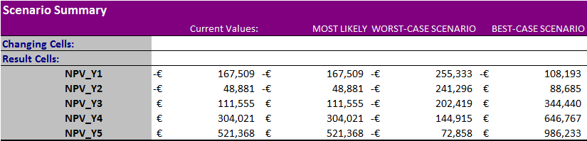
Figure 83 presents the result cells of the summary scenario (changing cells have been deleted). The current values are the same as the most likely scenario, since they are the value at the moment of running the summary. With the cumulated net present values in the next five years, we can now evaluate the risks and opportunities of this project.
OTHER TYPES OF SCENARIO ANALYSIS
We can also opt for a multivariate scenario analysis, by adding more intermediate scenarios. In this case a common practice is to assign a probability to each scenario to evaluate the risks and opportunities according to both the magnitude of the impact and the associated probability.
Another common technique is decision tree analysis, which tries to represent all the possible events with associated probabilities and impacts (see 75. SIMPLE DECISION TREES ). A more precise but more complex technique is to perform simulations, which rely on input variable probability distributions to create a distribution of possible outcomes (or scenarios). The advantage of simulations is a more accurate analysis, since we can calculate statistical parameters with accuracy, such as the standard error, confidence intervals, and so on (see 77. MONTE CARLO SIMULATIONS ).
More information concerning probabilistic scenario analysis is available in the following document:
http://people.stern.nyu.edu/adamodar/pdfiles/papers/probabilistic.pdf
75. SIMPLE DECISION TREES
OBJECTIVE
Estimate the probability of future events.
DESCRIPTION
A probability tree is a simple way to represent a “probability space” with independent and/or dependent events (conditional probabilities). Each node represents the chances of an event occurring after the previous event has occurred; therefore, the probability of a certain node is the product of its and all previous nodes’ probabilities. Here the risks and probabilities can be sequential or discrete, while in scenario analysis they are only discrete.
In a decision tree we have different types of nodes:
-
Root node: this is the first node and usually represents the question about whether to invest or not;
-
Event or chance nodes (represented by circles): these are events with several probable outcomes (each one with an associated probability);
-
Decision nodes (represented by squares): they represent all possible decisions that can be taken after an event outcome;
-
End nodes: these are the result nodes.
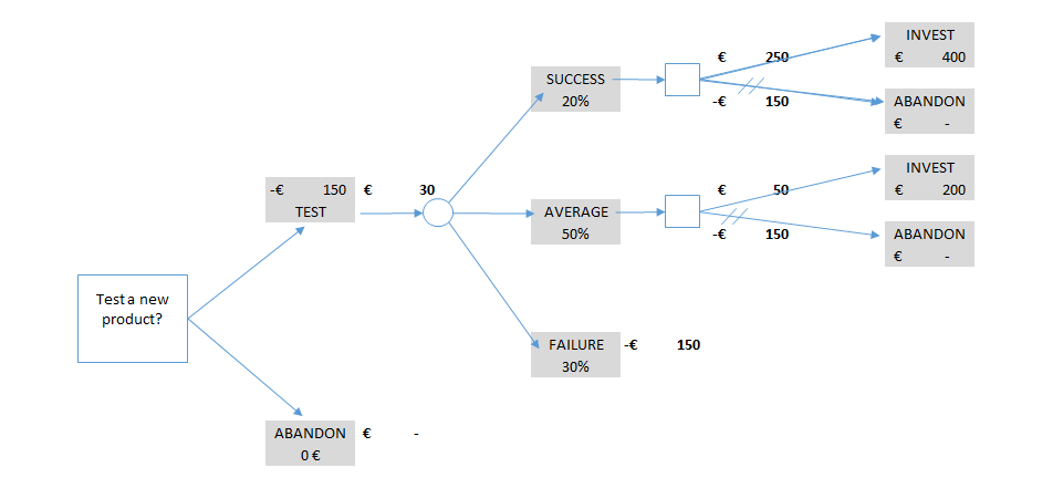
The steps in building a decision tree are:
-
Divide the analysis into different risk phases, meaning future events of which the outcomes are uncertain;
-
For each event define all the possible outcomes (if they are many or infinite we must simplify them with a manageable small number of discrete outcomes) and assign a probability to each of them (the probability must sum 1);
-
Define decision points, that is, decisions that can be made once an even outcome is known;
-
Estimate the value (or cash flow) at each node (the costs and revenues of this node and the previous ones that led to this outcome). If revenues are projected in future years, we should apply a discount rate (see 74. SCENARIO ANALYSIS );
-
Fold back the tree:
-
For each branch of a decision node choose the one with the higher value;
-
For each event node calculate the weighted average probability of all the outcomes.
-
With this method we “fold back” the tree until reaching the root node, where in our example investing in the new product is worth €30 and therefore it is better than abandoning it. We can also analyze the range of possible values (-€150 to €400) to gain a better idea of the risks associated with the investment. When we start the project, depending on the outcome of each event, we make the decision with the highest associated value. This process is very useful when we have several sequential nodes with several possible outcomes.
The data usually imply making assumptions and estimating probabilities of future events. Business acumen and experts’ opinion are extremely important in building a reliable probability tree.
76. GAME THEORY MODELS
OBJECTIVE
Anticipate competitors’ strategic decisions.
DESCRIPTION
Demand forecast or pricing models aim to find the optimal solution to maximize the benefits. However, this optimization usually does not take into consideration the fact that competitors are not static actors and will probably react to strategic decisions.
Game theory models take into account other players’ actions, and they offer theoretically an equilibrium in which no player can be better off from changing their strategy (Nash equilibrium). There are four main types of game theory models:
-
Static games of complete information: movements are simultaneous and all the players know the payoff functions of the others;
-
Dynamic games of complete information: movements are sequential and all the players know the payoff functions of the others;
-
Static games of incomplete information: movements are simultaneous and at least one player does not have complete information about the payoff of the others;
-
Dynamic games of incomplete information: movements are sequential and at least one player does not have complete information about the payoff of the others.
Another important element of game theory models is the repetition of the games , due to the fact that the strategy of players can change depending on the number of games. In this case we can calculate the net present value of future outcomes, since the nearest payoffs are more valuable than the most distant ones. There is also a series of assumptions when applying these models:
-
Players are rational;
-
Players are risk neutral;
-
Each player acts according to his/her own interest;
-
When making a decision, each player takes into consideration other players’ reactions.
Static (simultaneous) games are usually represented by payoff boxes, of which the most famous example is the prisoner dilemma. In this case the dominant strategy for both prisoners is to defect, since, in spite of the decision of the other prisoner, for both the decision to defect is the one with the higher payoff.
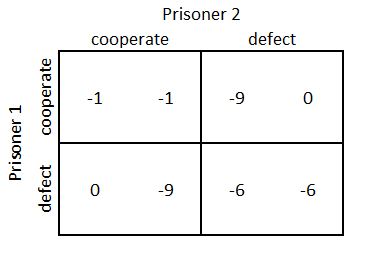
On the other side, sequential games are usually represented by decision trees with the payoffs and decisions of the players.
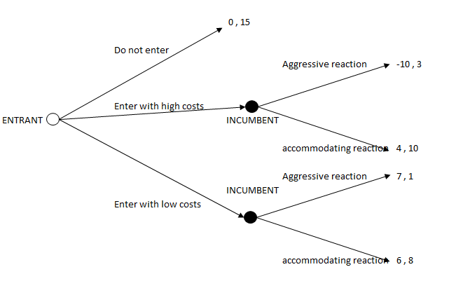
Some common applications to business are:
-
Market entry decision making
-
Price modifications
-
Quantity modifications
To find the solutions to these games, we use demand, supply, cost, and utility functions. Depending on the possible decisions that the players make, calculating these functions will define the payoff of players to determine the equilibrium of the game. When information is not known, we can use assumptions and weight them with a probability percentage, but this requires the creation of more complex models.
The template that I propose aims at profit maximization based on decisions about price changes. Profits (or payoffs) are calculated by the difference between a cost function and a demand function. The demand is a function of the price elasticity of the market and the cross-price elasticity with other competitors (this information can be gathered through several pricing techniques, for example choice-based conjoint analysis or brand–price trade-off).
More models are available online (Cournot, Bertrand, and Stackelberg games), and there are several Excel templates (for example http://econpapers.repec.org/software/uthexclio/ ). Data about competitors’ market share, costs, production limits, and so on should be estimated using industry data, published reports, and experts’ opinion (brainstorming, workshops, etc.). Prices can be collected more easily, since they are usually public. Data about price elasticity are calculated through surveys that include questions for price analysis techniques.
77. MONTE CARLO SIMULATIONS
OBJECTIVE
Determine probable outcomes.
DESCRIPTION
In deterministic models we predict events in a simple linear system and we assume that the initial conditions do not change. Besides, the same initial conditions will give the same results. However, the world is more complicated and events are usually determined by a complex interrelation of different variables, some of which are difficult or almost impossible to estimate. Monte Carlo simulations solve this problem by using probability distributions for each input variable and then running several simulations to produce probable outcomes. We can say that this model allows the prediction of an outcome without conducting many expensive experiments.
The steps for performing a Monte Carlo simulation are:
-
Define the mathematical formula for the outcome;
-
Identify the probability distributions of the input variables and define their parameters;
-
Run the simulations;
-
Analyze and optimize.
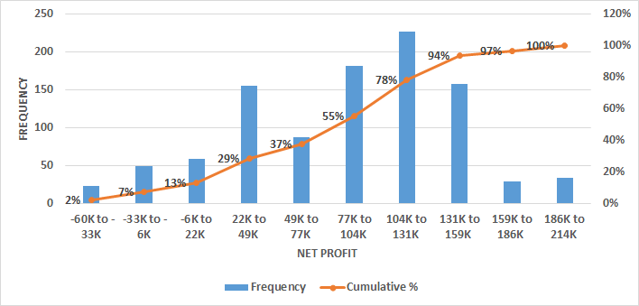
Input and Output Variables
The first step in a Monte Carlos simulation is to define the output, that is to say to identify the variable that we want to predict, for example “profits.” Then we should identify the input variables on which “profits” depend. Some of them may be certain; for example, we can have a fixed cost with a specific value, but usually they are uncertain. For each of the uncertain variables, we need to identify a specific probability distribution to use for the simulation. Examples of distribution are:
-
Discrete distribution: we define the probability of a finite number of values;
-
Uniform distribution: each variable value has similar probabilities (for example, when throwing a die, each number has a 1/6 probability);
-
Bernoulli distribution: we have only two alternative and exclusive outcomes (0 or 1);
-
Normal distribution: the central values are the most probable ones (defined by the mean and standard deviation);
-
Triangular distribution: we have a most probable value and a lower and an upper limit;
-
Other distributions: exponential, logarithmic, binomial, beta, etc.
Having identified the distribution, we can use a chi-square test (see 48. CHI-SQUARE ) to check whether the data fit the chosen distribution. An alternative would be to conduct a Korm–Smirnov test.
In this phase we also write the mathematical formula by which the outcome is defined, for example:
Profits = (Price – Variable cost) * Units – Fixed Costs
The simulation is then performed repeating the input variables (with each specific probability distribution) hundreds or thousands of times to obtain a distribution of probable results.
Analysis and Optimization
Once the range of probable results has been obtained, depending on the objective, we use indicators such as the minimum value, maximum value, average, standard deviation, and so on. In general we usually compare:
-
Expected value: the mean of all the outputs with its confidence intervals;
-
Risk: in the proposed example it is the probability of negative profits (% of outputs < 0), but we can also choose a specific value.
It is also possible to compare different simulations with different input variables’ values or distributions. To compare them, we should calculate the confidence intervals of both expected values and risks. If the range between the confidence intervals does not overlap, we can infer that one scenario is better or worse than the other one.
If the objective is to use the results for a business plan or in risk analysis, we can stop here, but if we want to optimize the outcomes, a sensitivity analysis is needed. In this kind of analysis, we measure the “importance” of each input and may decide to act on the most influential ones. Usually the correlation coefficient between each input and the output is used, but different techniques can be adopted.
78. MARKOV CHAIN MODEL
OBJECTIVE
Calculate the probability of future events.
DESCRIPTION
A Markov chain is a random process in which for each iteration we have a transition from the current state to another state. The number of states is finite, and the probability of passing from one state to another is only determined by the current state and not by the previous ones (called the Markov property). Once the goals and the business model that we want to represent have been defined, the first step is to identify the different states and the probability of transition from one to another in a probability transition matrix.
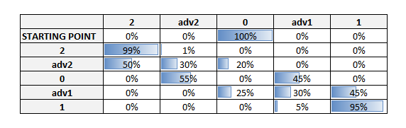
In the proposed example, two companies (1 and 2) are fighting to dominate a specific market. There are five different states:
-
“0”: equal market share;
-
“adv1” and “adv2”: when a company gains a significant advantage in the market share;
-
“1” and “2”: when a company dominates the market.
In this model we want to represent a situation in which only one company can survive and its goal is to dominate the market. The second assumption is that the more it gains market share, the more probable it is that the company will dominate the market. The last assumption is that company “2” is slightly better positioned than company “1.” Hypothetically, we can imagine that each month we have a new iteration in which the business tactics are modified; we can then simulate the probability after 20 months that company “2” will dominate the market. In our simulation there is almost a 60% chance that company “2” will dominate the market (Figure 89 ).
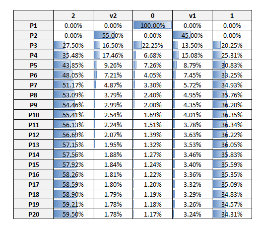
The example presented and the related template concern a “discrete-time Markov chain,” but a “continuous-time Markov process” model also exists. For more complex analysis, we can use either Excel add-ins[^34] or statistical tools.
79. SALES FUNNEL ANALYSIS
OBJECTIVE
Improve the conversion of prospective customers buy optimizing the sales funnel.
DESCRIPTION
Models that estimate demand usually focus on a specific aspect of the sales channel. For example, a pricing model usually defines the choice of customers in front of a set of possible products or services; however, it does not take into consideration the awareness of a product in the market (it usually assumes full awareness to simplify the analysis).
Ideally, these pricing models (see PRICING AND DEMAND models) have to be included in a broader framework called the sales funnel. A sales funnel consists of four main elements:
-
Market: the total number of potential customers;
-
Awareness: the people in the market who know the product;
-
Consideration: the people who know the product and take it into consideration for purchasing;
-
Conversion: of the people who consider the product, those who actually buy it.
These elements are related to each other, for example:
-
70% of people in the market are aware of the product (market awareness);
-
80% of people who are aware of the product consider purchasing it;
-
10% of people considering it actually purchase it.
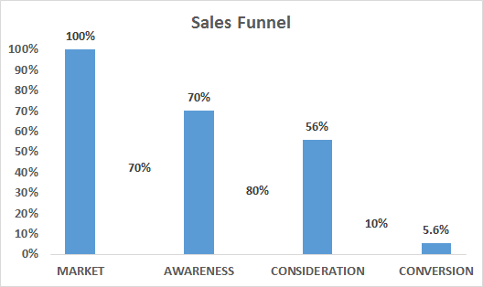
We can calculate that 56% of all potential customers consider the product (70% * 80%) and that 5.6% buy the product (70% * 80% * 10%). We also can calculate that 8% of people who know the product will buy it (5.6% / 70%).
An increase in the number of people in the market will result in an increase in purchases, since (usually) we assume that the relationships or ratios remain the same: 70%, 80%, and 10%. Data on market changes can be derived from public population data. For example, if our potential clients are males with an annual income between €40,000 and €80,000 and this sector of the population increases, then our “market” increases.
Besides the market, we can act on the relationships between market awareness, awareness consideration, and consideration conversion to increase the sales.
Market Awareness
In our example 70% of people know our product, but we can increase this ratio by investing in advertising, public relations, special offers, and so on. The effect on sales of an increase in people’s awareness can be calculated using the other ratios, which we assume do not change (80% awareness consideration and 10% consideration conversion). However, we have to consider that this assumption may not be completely true and either use corrective measures or just be cautious in interpreting the results. In fact, the remaining 30% of the people in the market who do not know the product may have lower consideration and conversion ratios, for example because they are more loyal to a specific brand and they do not know us or because they are not interested in looking for an alternative product. In this case, even if we make them aware of our product, it is probable that the awareness consideration ratio of these people will be far lower than our 80%.
Awareness Consideration
Out of the people who know our product, some of them will not consider it for a purchase either because they are loyal to a brand or because they think that our quality and/or price levels are not acceptable. There are two main ways to improve consideration:
-
If the price or quality are good but the low consideration is due to people having a worse perception than the reality, we should invest in communication;
-
If people have a correct perception of the price and quality, we can improve them (higher quality and lower price).
Investing in communication will improve the number of aware people who consider our product, and we can calculate the increase in sales using the consideration conversion ratio of 10%. We assume that the conversion ratio does not change, but, as in the abovementioned example, this assumption may not be completely accurate.
If we improve the quality or lower the price, it is probable that the consideration conversion rate will also change, since the product is more attractive to those people who have already considered it.
Consideration Conversion
In this case price and quality are the main drivers, but here they are compared with other alternatives (this is a similar concept to the reference price vs maximum price explained in the introduction to PRICING AND DEMAND models). The effect of a price modification can be derived from several pricing and elasticity models.
Optimization
With the proposed model, we calculate the impact on volume, more specifically the number of additional customers, but we should include other elements to decide which strategy to pursue:
-
Revenues: revenues depend on the average number of purchases and on the average price. Take into consideration that if we lower the price we may also have a positive effect on the number of purchases (depending on the product) but there will also be a negative effect since we are selling cheaper;
-
Costs: the costs of advertising, communications, and quality improvements have to be included in the model.
Once we have defined the structure of the costs and revenues associated with the model, we can use Excel Solver to find the optimal investment plan (see 80. OPTIMIZATION ).
80. OPTIMIZATION
OBJECTIVE
Optimize the output of a model by changing the values of several decision variables.
DESCRIPTION
Optimization means finding those values of certain decision variables that optimize the result (or output variable). Decision variables are elements in which we can intervene, for example the price of a product or the investment in advertising, while the result is the combination of formulas and functions contained in the model after modifying our decision variables (an example would be “profits”).
Here I am using the same example as in chapter 79. SALES FUNNEL , in which I defined the four stages of a potential customer: market, awareness, consideration, and conversion. The relationship between the elements is represented by ratios; for example, 70% of people in the market are also aware of our product, 80% of aware people consider our product for a purchase, and 10% of those considering our product finally purchase it. To improve our sales, we can act on three decision variables: increase awareness, increase consideration, or increase conversion. For the sake of simplicity, we assume that we can increase awareness directly by investing in advertising, we can increase consideration by investing in communication, and we can improve conversion by lowering prices. We also assume that a client purchases just one product.
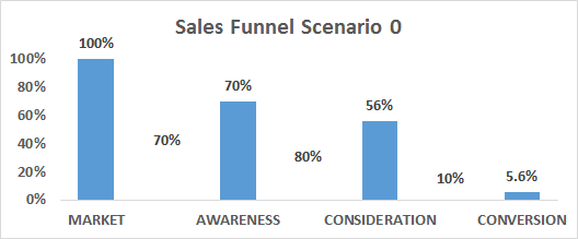
The first step is to define the model to be optimized by identifying the relationships between the variables (Figure 92 ). The target variable is “profits,” which depend on three variables: the variable costs (which do not change), price, and number of products sold. The number of products sold depends on the conversion rate and the number of people who consider our product. We can continue with this reasoning until the end of the diagram. All the connections in the diagram have been defined with functions in the template, and in particular we are interested in the relations of our main three decision variables (price, communication, and advertising). These are the variables that we can modify according to our business decisions to increase our profits:
-
Price: we can decrease the price of our product to increase the conversion rate and therefore the number of products sold (see the Excel template for the precise calculation), but at the same time it has a direct negative effect on profits, since the number of products is multiplied by a lower price.
-
Communication costs: we can increase the communication expenses to improve the consideration of our product (the more we convince people, the more costly it will be to convince new ones).
-
Advertising costs: we can increase our investment in advertising to augment the number of aware potential customers, but, as for communication, it will become more and more expensive as we approach 100% of the market.
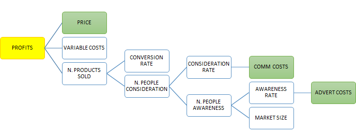
At this point we open Solver in Excel (Data – Data Analysis – Solver)[^35] and define our variables (see Figure 93 ):
-
Objective is the cell with revenues – costs, and we check that we want that cell to be the maximum (the yellow cell in the template);
-
Changing variable cells are the cells containing our decision variables (price, communication costs, and advertising costs); select them using CTRL if they are not consecutive cells (green cells);
-
Constraints (red cells): we define three types of constraints:
-
That our awareness, consideration, and conversion rates cannot be more than 100%;
-
That we have a total budget of €120,000 for advertising and communication expenses;
-
That all non-constrained variables must be non-negative (check this box in Solver).
-
-
Optimization method: we use a GRG non-linear method, since not all of our combinations of functions (objective, decision variables, and constraints) are linear. If we try to use the Simplex linear method, Solver will report that it cannot solve the model.[^36]
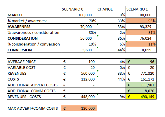
The results show that we can increase our profits by investing €112,000 in advertising and €8,000 in communication and lowering the price by 4%. They also show that the most important strategy action concerns the awareness rate, which was increased by 33% until reaching 93% of the market, as shown in Figure 94 .
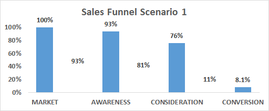
[Ad Space — Insert ad script here]
Related
A structured reference on modeling from business processes, declaring grain, avoiding fact-to-fact joins, using semantic layers as the governed interface, and when graphs complement dimensional BI.
Open resourceA structured guide to effective data visualizationÔÇödefining the insight before the visual, guiding attention, choosing encodings, and presenting clearly for BI and analytics teams.
Open resourceA structured reference from solution purpose through modeling, security, refresh modes, deployment pipelines, and AI-ready semantic models for Microsoft Power BI and Fabric.
Open resource